Chip Kidd
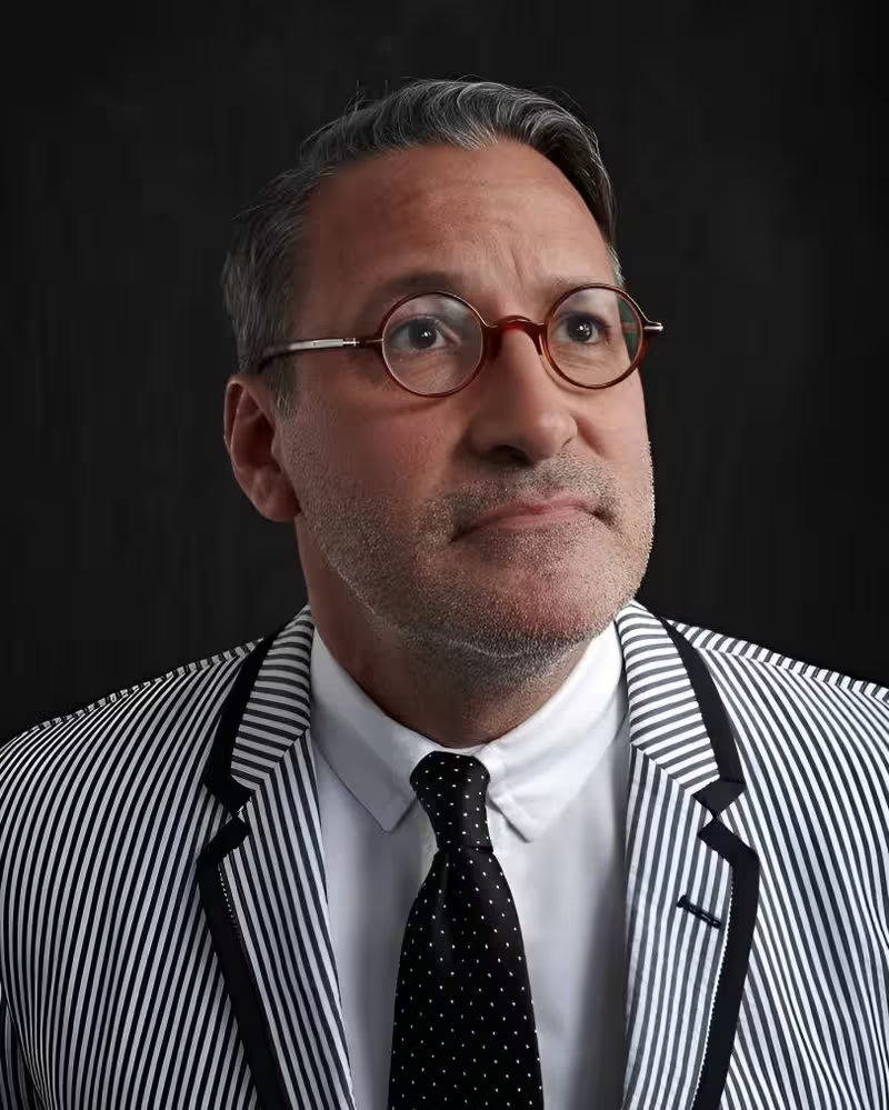
Chip Kidd is an award-winning graphic designer and writer in New York. His groundbreaking book jacket designs for Alfred A. Knopf have elevated the form for close to three decades. He’s worked with hundreds of writers, including John Updike, Katharine Hepburn, Cormac McCarthy, Henry Louis Gates Jr., James Ellroy, Karen Russell, Michael Crichton, David Sedaris, Sharon Olds, Orhan Pamuk, Paul Simon, Neil Gaiman, and Haruki Murakami. His first novel, The Cheese Monkeys, was a national bestseller. His most recent book, Go: A Kidd’s Guide to Graphic Design, is the first book to teach graphic design to children and has over 60,000 copies in print.
As an editor and art director for Pantheon Graphic novels, he’s worked with and published some of the very best cartoonists in the world, including Chris Ware, Art Spiegelman, Dan Clowes, David Mazzucchelli, Charles Burns, Michael Cho, and Alex Ross. He is the recipient of the National Design Award for Communications, and his TED Talk has been viewed over 1.3 million times.
Talk: ! Or ?
When should design be clear, and when should it be mysterious?
Transcription
[Music] [Applause]
Hello. Thank you all for coming. I was worried that I was going to outnumber you.
[Laughter]
It’s been a long day and it’s about to become even longer.
So, not too long ago, this quote was brought to my attention. I can’t remember by who. I mean, it’s not like I have a Google search on myself.
[Laughter]
But I started thinking about, well, this seems to be extremely flattering, but what does it mean? And I couldn’t really figure it out. So basically I did what anybody else would do, which was I went to Meryl Streep and I said, you know, Meryl, what does this mean?
And she said, I don’t know. And I don’t know who the fuck you are, but get out of this room.
[Laughter]
So it still remains unanswered, although later on I’m going to explore this theme of Meryl-ness in my work further.
But what I’m really here to talk about is clarity or mystery. When you’re making anything creative, when should you be clear and when should you be mysterious? Most of what I do, as you will see, is book covers. And there’s a balance, and I’ve been doing this for almost 30 years, so there’s a balance that I’m constantly weighing. When should something be obvious what it is, and when should something really kind of invite your curiosity?
Fraud
I’m going to start with a case study of a book of essays by a dear departed friend of mine, David Rakoff. And this word, fraud, of course means that he is not what he says he is. His shtick as a writer was that he would get sent out on assignment by magazines to do things that he had absolutely no business doing. He was this skinny little urbanite guy from Toronto who had relocated to New York, and then GQ magazine would send him whitewater rafting down the Colorado River just to see if he’d survive. And then he would write about it.
So he took on this persona of a fraud, as somebody who said he was one thing when actually he was something else. And I wanted the book itself to misrepresent itself the way he did. I was using the visual vernacular, the visual language of one thing pitted against what the thing actually was. This is a concept about form – what something looks like, or the formal aspects of it – versus the content of it, of what it says or means. And again, at the end of the presentation, I’m going to dramatically embody this for you.
But in the case of this book cover, I started with the visual vernacular of something that’s always fascinated me, which is advertisements for erectile dysfunction medication.
[Laughter]
Okay, I’m afraid we all know what I’m talking about. That is, these ads that can’t show the product in use. Okay, so, right, so here is the idea of, you know, we’ve just had sex. It was very successful. And now we’re going golfing.
[Laughter]
And, you know, you’d see this in a magazine. It’s like, oh, oh, I see. And his name is sort of visually represented as, you know, all of those after effects. Like if an unborn baby twin starts growing out of the side of your head, then please stop taking Effects, or…
This, nobody understood at all. This only bothered and upset everyone who saw it, including the publisher. So I had to start over.
And then I started thinking about graffiti. I live and work in New York City, which I love, and I’ve done so for 30 years. And I started thinking about the visual vernacular of graffiti, which certainly here in Berlin is taken to extraordinary extremes. This is just some sort of power box, utility box in the Lower East Side in Manhattan. And what fascinates me about this kind of graffiti is that clearly the people who have tagged this are trying to send some sort of message. Now, whether you view graffiti as a charming urban affectation or as a willful destruction of public property, there’s one thing about this that we can all agree with, and that is we cannot read it.
[Laughter]
Which makes it kind of pointless.
But there’s another kind of graffiti that I encounter in New York all the time, especially on the subway, which frankly I find much more interesting, and I call it editorial graffiti. Now, this is a picture I took recently. Airbnb, which I’m assuming we all know what that is, is the subject of a lot of controversy in New York, because it hasn’t become really officially legal yet, and yet Airbnb posted this advertisement on the subway. And then somebody took out their Sharpie and decided to editorialize on it.
And I’m not saying I agree with them or don’t, but when I see this, at least I know what the graffitist is trying to say and the point they’re trying to make.
So I’m going to bring this idea back to David Rakoff’s book. I go into a bookstore – yes, a bookstore – and I buy this. Buy it! And I start to read it, and I’m thinking, “Well, wait a minute. You know, this guy, he doesn’t really seem like he is what he says he is. He’s a fraud, man.” And I keep reading it, and I get angrier and angrier, and I get out a red magic marker, and I just do this to it. Ha! That’s what I think of your book.
And this became the answer. This was the cover of the book as it went out. And it was a lot of fun at the time to go into a bookstore and see a whole row of these. It looked like some nut had taken a magic marker and just written all over all of them.
Mary Roach
This was a completely different kind of problem. Mary Roach writes these great populist books about things that you normally either don’t know about or don’t want to, like the human digestive system. But she makes them really interesting and fun. And so I started to think about the human digestive system.
This is a self-portrait that I took one morning. When I wake up, I look in the mirror and I stick out my tongue, and if it’s not black, I feel like I’m good to go.
[Laughter]
And so all of a sudden it’s like, well, ding, this is literally our entrance into the human digestive system. But as we can see here, photographs of open human mouths are disgusting. So we don’t want to frighten people out of buying this book, so we hire an illustrator and we get them to do this. And of course we want to show the beginning of the human digestive system and not the end of the human digestive system.
[Laughter]
Unless that’s what you want. But I think you’re in the minority.
The Mysteriometer
Clarity or mystery. So I really explored this idea in a project for the TED conference people. Not to plug a rival of this organization, but I created a book about this for them.
And I’ve been asked so many times, can you really judge a book by its cover? To the point where I want to say, just go fuck yourself. You can judge a cover by its cover. Period. The book is something else entirely.
[Laughter]
Like I needed to say that. Anyway, so this is the cover of the book, which I thought pretty much said what it needed to say.
And so what I try to explore in this book is, there’s something I use called the Mysteriometer. At the one end of it is super clarity, and then at the other end is super mystery. But the thing is, what happens when they get mixed up?
So this is an example I’m about to show. This is not my work. And I’m not going to name names because I don’t need the legal hassle. But here is something that I call useful mystery. This is mystery that we love, right? The design of this, the redesign of this particular version of the Diet Coke can, is mystery in its absolute best form. As in, first of all, it’s beautiful. And it’s a mass-produced object. It’s not an art object. This wasn’t done in a limited edition. This was everywhere all over the globe.
And it gives its audience so much credit. It basically says, you understand the visual language of our brand that we can do this to it. That is, we can blow it up and reduce it to its most essential parts – which we will explore a little bit later with a completely different kind of brand – and you’ll still know what it is, and you love the product, and this certainly isn’t going to keep you from buying it. It just seems a celebration of its audience’s intelligence.
Which makes the following all the more confounding. So this is something that I call, then, unuseful clarity. I took all these pictures. This is me going through the subway station at Times Square in New York, I’d say about a year ago. And as per some of these big ad campaigns, they just buy out the entire station and plaster all their shit all over the place.
And so the first thing I encounter on my way to the One train is this billboard. “You move to New York with the clothes on your back, the cash in your pocket, and your eyes on the prize. You’re on Coke.”
[Laughter]
“You move to New York with an MBA, one clean suit, an extremely firm handshake. You’re on Coke.”
[Laughter]
And of course, not even the support beams were spared. So here they revert to the language of Yoda from Star Wars. “Mmm. Coke, you’re on.”
[Laughter]
Well, you know what? I’m not on fucking Coke. Fuck you.
[Laughter]
And this ad campaign was immediately recognized as an enormous misstep. It was pulled within a week, basically due to huge negative feedback from people on YouTube and Twitter and everything. And it just kind of amazes me how this particular entity can get the packaging so right and so absolutely perfect, and the advertising completely wrong.
So we can all ponder that for the rest of eternity.
Augusten Burroughs
Now I’m going to go back to books. Augusten Burroughs is a wonderful humorist who is probably most famous for a memoir he wrote called Running with Scissors. I did not design that, but his next book was going to be called This. And so he called me up and he said, “This is the title of my next book.” And I said, “Oh my God, I know exactly what I want to do for the cover.” And he said, “What?” And I said, “I’m not going to tell you.”
[Laughter]
I’m a terrible lawyer or pitch person for my work. When I come up with an idea, I don’t go to the editor or to the writer or to the author or the marketing department and say, “This is what I want to do.” I instead just do it and let them react to it.
So what I did instead was I called up my good friend and colleague Geoff Spear, who’s a photographer. I told him my idea for the cover. And so we put an ad on Craigslist for a very specific kind of hand model. We got a lot of crank responses, but then we finally found the right guy.
And this was a freelance job, so I sent it off to the art director and he responded immediately and he said, “Everybody loves this, and marketing loves it, especially because it’s yellow and it has a hand on it.”
And I said, “Well, good for them.”
[Laughter]
All right. Now, this is the actual cover of the book. It came out. It was a big bestseller, although a big part of what I just told you was a giant stinky lie. This is my hand, which only has five fingers. Geoff is a Photoshop whiz, and so he can make this sort of thing happen and make it look completely natural.
All right. So then the book comes out and then Augusten gets an email from a female fan in Phoenix, Arizona, a woman who says, “When I saw the book, I burst into tears because I realized I was not alone.”
This is not a Photoshop trick, although I sort of wish it was.
[Laughter]
And at first my reaction was anger, as in, “Where the hell were you when we were making this book cover? Sister.”
[Laughter]
Don’t you go on Craigslist? And then I realized that the redeeming feature of this picture is the 30% off sticker, which of course should say 30% more.
[Laughter]
Math whiz in the audience.
I think it’s perceived that I’ve been doing this for so long and I’ve gotten a certain kind of reputation, à la the Meryl Streep thing, that whatever I do – I get a manuscript for a book and I read it and then I think real hard and then I part my cheeks and out comes my idea, and I pick it up and I say, “Look what I made!” And the publisher and the author say, “Oh my God, this is so great!” And they jump up and down and then all of a sudden rose petals are released from the ceiling and the champagne corks are popping and there’s laughing and dancing.
Nope. Nope. I get my shit rejected all the time, and I deal really well with it.
[Laughter]
Okay. So Augusten’s next book was about his take on how shitty Christmas is, and has this great title, You Better Not Cry.
So I’m thinking this is going to be so easy. Now, at the time I had a friend, another photographer named Tom Allen, who was doing a blog called The 12 Tawdry Days of Christmas. He’s in the Midwest in the U.S. and he was going to his local – what we call the Goodwill, which is like a thrift shop – and getting the most tawdry Christmas gewgaw he could and taking a picture of it and posting it: “Ha ha, isn’t this crappy?”
So I contacted him and I said, “You know, there’s that little ceramic figurine that you’re using that I think is great. Can I use it on this project?” And he said, “Sure.” So here’s this little girl dressed for the winter with a Christmas wreath, and she’s freaking out. We don’t know why, but it doesn’t matter.
So I’m like, done, aced it. And I send this to Augusten, and he writes back right away and he says, “You know, this is cute, but it’s not mean enough. I’m really mean. So please keep going.”
So then I go back to Tom Allen and I said, “You know, there was this other shot you had of this ceramic Santa Claus candy dish. Can we work with that?” And so Tom then sends this to me.
And I’m thinking, you know, all right, this is a good start. But instead of people, could we try firearms?
[Laughter]
Because this is America. I’ve never tried that one before here in Europe.
[Laughter]
Also, let’s be subtle and turn Santa around from the back. So, you know, the audience has to work a little bit.
So I’m thinking, all right, we’re almost there. But now, now, now let’s bring back the little girl.
[Laughter]
Yes, yes, yes. Now we have a narrative. We have a story. We know why she’s freaking out. She completes the whole picture. Yes, we’ve aced it.
So I send it to the art director and a week goes by and I hear nothing. Now, we all know in this day and age, when you don’t hear immediately, it’s a really, really bad sign. Really bad. Like, we hate it. We don’t know how to tell you. We’ve already hired somebody else.
Another week goes by. Finally, by the third week, the art director calls me and he says, “Well, you know, this just wasn’t working for people here. We felt it was too mean.” And he said, “But also, in the marketing meeting yesterday, we spent 10 minutes debating about whether or not Santa is showing the little girl his penis.”
[Laughter]
So I said, “Do they want him to?”
[Laughter]
And he said, “No! No, they don’t.”
And then he said, “Do you want to keep going, or do you want to bill a kill fee and end it all now?” And I said, “No, I want to keep going. It should be so easy.” So he said, “Okay, show me some more ideas in a week.”
And so I start thinking about, well, what other crazy things do people do to celebrate the birth of our Lord? And this became kind of the next answer. I mean, I don’t know about here in Europe, but you see this in New York all the time. So how do you celebrate our risen Lord better than to clamp a pair of bunny ears onto your cat, or to turn your cat into the sacrificial lamb, or – the best yet – to strap him with the quacky hat?
[Laughter]
Yeah. And so this captures the essence of Augusten’s bile so perfectly. Like, you know that this cat is very, very angry.
But of course, the problem is this is the wrong holiday. So we have to steer it back to the birth of the baby Jesus with something like this, or something like this, which is illegal in half of the United States to do to your pet.
[Laughter]
This was sweet, but it’s a little too Dr. Seuss. But I thought this guy looks really, really sad. But let’s give them some options. So, knowing that Augusten actually has a pit bull, then we give them this. And I would really like to think that the nanosecond that the shutter was snapped, the photographer’s face was bitten off.
[Laughter]
All right. So I’m thinking, yes, I’ve aced it. And a week goes by and I hear nothing. And two weeks go by and I hear nothing. And then finally, by the third week, the art director calls me and says, yeah, you know, none of this is working here. So we solved it in-house. Bill a kill fee.
Defeat. But what’s interesting in something like this is to see what they actually come up with, which of course they can’t hide. And eventually the book comes out, and what I’m about to show you is real, and I don’t know who did it and I don’t care. But this is what they decided.
[Laughter]
So they rethought the whole Santa penis thing, as we can see.
Batman
So, all right. Switching gears here. I’m a big Batman geek fanatic. Absolutely. This is Halloween 1968, West Lawn, Pennsylvania. That’s me on the right. That’s my brother on the left. That’s my mom in the middle. She’s a bad mom. And she made these outfits for us from scratch.
[Applause]
So, yes. Yes. Thank you, mom.
And so I still have most of these outfits in a little box. I don’t put them on anymore.
[Laughter]
Point is, you know, a lot of the country was going through this at the time, but a lot of them also grew out of it. I never grew out of it. And I’ve gone on to do a lot of work with DC Comics and the character.
The most recent thing I’ve done was I wrote a story for an anthology series called Batman Black and White, which is just eight-page stories with artists that can’t commit for a long run on the book, but can fit an eight-page story into their schedule. But what I didn’t realize was that DC was issuing what’s called a blank sketch variant. Now, I know most of you in here are not comic geeks, and that’s fine. You breathe through your nose, not your mouth, and that’s the way it should be.
[Laughter]
But anyway, once this became clear to me, I decided to make this a mad personal fan quest – to buy up as many of these copies as I could and to have illustrators who I respected and artists I respected draw directly on them and do their version of Batman for me. And it sort of grew insanely.
This is a guy named Dave Bullock, who worked on the animated show. This is all magic marker. This is a guy named Klaus Janson, who was the inker on The Dark Knight Returns with Frank Miller, which is the basis of the new Batman and Superman movie that’s coming out next spring. This is a guy named Mike Allred, who’s drawing a version of Batman from the ’60s from TV. This is an Italian artist named Simone Bianchi, who lives in Lucca.
So I’m calling in a bunch of favors. I’m also using this project to kind of reach out, because I don’t deal with a lot of illustration, even though I’m an art director. Mostly I deal with photo illustration. But this is all handwork. This is all ink on paper.
This is Charles Burns channeling Bob Kane. This is a young guy from the Philippines named Kerby Rosanes, who somebody just sent me a link to his site. He’s 23 years old. And he agrees to do it. And then he sends me a JPEG of this. And then I do a little art directing, saying, you know, everybody hated the logo because it’s big and it’s in your face. And I said, well, let’s take his face and pull it out in front of that and put it behind.
And then there’s all these different versions of Batman that have appeared in the last 75 years. This was the very first movie version of Batman, from 1943. Lewis Wilson. You know, this was all done for like 25 cents. This was the age of what we call the Saturday morning serials. And this is an artist named John Cassaday, who loves these.
This is getting very geeky here. This is a doll that was constructed based on this, including the sweat stain on the costume. And then this artist, Randy Glass, did his version of that in pointillism on paper.
This is a guy named Drew Friedman. This is an ink wash onto the cover. This is a guy named Dave Gibbons, who was the co-creator of Watchmen with Alan Moore. He’s a Brit. This guy is from Canada, Paul Rivoche. And he really went completely all out with the Batcave. This is another Canadian guy, Ryan Heshka. And this is hearkening back to the very first year of Batman, when they were still figuring out the character. And he had guns at the time. And so his first major supervillain was Dr. Death. And so he shot him.
[Laughter]
They rethought that very quickly.
Then artists who normally would never do Batman. This is Barry Blitt, who does all the wonderful topical covers for The New Yorker, usually with Obama or Putin or Donald Trump, doing Bat Hamlet.
This is Gloria Vanderbilt, who is 92 and a dear old friend and is probably best known now as the mother of Anderson Cooper on CNN. Those are her real lips. I asked her to do her lip imprint with her own lipstick. Those lips have kissed Frank Sinatra, Howard Hughes, Leopold Stokowski and Marlon Brando, to name just a few.
This is an actual artist named Philip Pearlstein. And if you don’t know his work, you probably do know his work, you just don’t recognize it. This is what he normally does. He hangs in every major museum in the world and is a great old friend of ours and just sort of humored me.
This is a wonderful artist named Celia McGee, basically doing “What if Catwoman was drawn by Egon Schiele.”
This is a woman named Alison Bechdel, who’s done this incredible graphic novel called Fun Home, which has just been made into a Broadway show, which won the Tony, and she’s wonderful.
This is this crazy guy named Jeffrey Brown, who’s done these children’s books on Darth Vader’s little girl, Princess Leia.
This is my friend Christoph Niemann. Good old Christoph, your city mate. He lives here in Berlin. Brilliant guy.
This is a designer named Stephen Doyle, who I would highly recommend for this conference, who normally doesn’t do work like this at all. He completely surprised me and decided to sculpt Batman, which is not really what he does.
Dave Plunkert, wonderful designer from Baltimore. This is a guy named Howard Cruse, who was one of the original Zap guys from the ’60s, who did an incredible graphic novel called Stuck Rubber Baby. This is the Joker as your evil dentist.
And then this woman, Roz Chast, who does a lot of work for The New Yorker. This is a guy I discovered at New York Comic Con. This is back to the TV show. This is pencil on paper.
This is a woman named Vanesa Del Rey, who is now working out of Miami. J. G. Jones, great comic book veteran. And then Adrian Tomine, Optic Nerve. Brilliant, brilliant artist. Lives in Brooklyn. Who is again so gifted, but otherwise would never draw Batman, except that I asked him.
This is a Japanese artist named Geraya. This is also pencil on paper, directly onto the cover.
This is a woman named Maira Kalman, doing the Bat Burqa. I mean, is that Batman or Batgirl or Bat Whatever? We don’t know. Just amazing.
This is a guy named Gary Gianni, who was the last artist to professionally draw Prince Valiant, and he did this, which hearkens back to the pulps from the ’20s, before actual what we know as comic books even existed. So it’s the idea of Batman startling these two safecrackers from the ’20s.
This is a wonderful artist named Jim Lee, who has been lately working on Batman and Superman, but I love his take on Robin. Just the elegance of his line is amazing.
This is a designer and art director from LA named Pash, who I’ve known forever, who works at ABC Television. And what he’s doing here is he’s referencing this image by Frank Miller from The Dark Knight. And just for fun, he did two other different versions of black and white, and what he did was he took the first five pages of dialogue from The Dark Knight Returns and hand-lettered them into the shape of this version of Batman, which was amazing.
There’s a wonderful artist named Art Spiegelman, who’s a dear old friend, who became notorious for creating this image on The New Yorker, and then applied it to this project, which I thought was absolutely fantastic, brilliant.
And then this was a comic book cover that I’ve been obsessed with since I was a kid. And again, this is in the first year of Batman’s existence, when his ears were really long and he was really scary. And here’s Dr. Death again, trying to inject some poor bastard with some sort of chemical. This became infamously known as the needle cover of Detective Comics.
And so when Alex said that he would do it, he asked me what I wanted him to do, and I said, “Well, I don’t think I’ve ever seen you do the needle cover.” The thing about Alex’s work, if you don’t know it, is that he’s sort of the Norman Rockwell of comics. So he takes this idea and turns it into an extremely photorealistic illustration. And again, this is ink and ink wash directly onto the comic. No digital anything was allowed to be used by anybody.
And then of course I had to cough one up, and I completely copped out by just cutting a big die-cut hole in the whole thing and coloring it and showing the art underneath. So that was mine.
And so as these started to accumulate, I decided, well, I’ve got to do something with them. And so there’s a show right now of 88 of them at the Society of Illustrators in New York, and that is up for another week. And then what I’m going to do with them, with the blessing of DC Comics, is to collect them in a book to benefit something called the Comic Book Legal Defense Fund, which is basically an anti-censorship group that goes after colleges and schools that ban certain comics and graphic novels in America and abroad, which unfortunately happens all the time.
And this is another view of the show, and the way they hung it was really great and put this wonderful red color behind them. So that is that.
Murakami
One of the artists, authors I’ve been honored to work with for over 20 years is the Japanese writer Haruki Murakami. And I’ve given several TED talks, and the first one culminates in my presentation of designing a cover for him called 1Q84, which was a book designer’s wet dream title. It’s called 1Q84. Haruki Murakami in the middle. You can get really big and graphic with it.
Well, the title of his next novel was called this, which is utterly thankless. It doesn’t really seem to roll off the tongue.
But basically what it’s about is five friends in Japan. They are a very close group in high school, and then they graduate, and then they go off to college, and then they reconvene the following summer. And four of the friends, in Japanese, their name corresponds to a color. So there’s Mr. Red, Mr. Blue, Miss White and Miss Black, and then the guy who’s narrating the story, his name doesn’t correspond to a color. So he is nicknamed colorless.
And when he tries to reconnect with them that summer, they call him up and say, “We are cutting you off. We want nothing to do with you ever again. Don’t ever try and contact us.” And they give him no explanation, and it totally sends him into a tailspin of despair, and he has to try and reconcile why this happened and how to build his life back together. And then 20 years later, he goes to reconnect with the friends to find out why they did this.
And so there is one passage in the manuscript that describes the friends this way. And so I started thinking about, again, how much information do you give the potential reader, and how much do you just suggest without clearly telling?
And so with this incredibly long and complicated title, I felt that Murakami had come to the point in his career where it’s the new Haruki Murakami novel. It’s going to be known as Colorless, and then the rest of it will follow through.
So this is the outside cover of it, but the fingers of the hand are actually windows into what’s underneath. And when you take the cover off, what you get is a schematic of the Tokyo subway system, with an enlargement of the metaphor of the four lines being the friends, and then he’s colorless, and he’s crossing them at each stop. And the subway system takes on meaning because that’s what he eventually comes to work on. He becomes an engineer for the Tokyo subway system.
And so when I do something like this, I pretty much do do it by hand. Like, this is my first comp that I printed out and, you know, cut up, and I just laminated it with plastic tape at work. And this I’m just photographing on the floor of my office, which has this luxurious carpeting, which you can see.
[Laughter]
And so this was basically my initial design proposal, and I showed it to my editor in chief, and his only change was – because I told him that that gray is not going to be gray, it’s going to be silver, it’s going to be silver ink – and so he said, I think that black type is going to read better on silver ink than white type. And other than that, it was fine. It was okay. And so that is what I did.
And this gives you a better idea of what the three-dimensional object looked like. This is the finished book, and it’s sitting on my desk in my office. And so even before ebooks and all of that, really, most of my work is in hardcover first editions of books. So I want these to be objects that you want to own. If you want to read this on a tablet, go ahead, but you want to have the thing. And that has borne itself out. This was the first book in his entire 25-year career that debuted at number one on the New York Times bestseller list, and stayed there for three weeks, which was a big, big thing for us and for him.
Just also for me, because it’s so weird. I mean, this is just strange looking. And it’s the kind of – it’s mysterious, and it takes on more clarity the more you read the book.
And this is me with Mr. Murakami. This is two days ago, when we were at a lunch at the Academy of Arts and Letters. And he’s just a wonderful person and artist, and really easy to work with. And he’s adorable.
So after that was this crazy book that he sort of wrote for kids called The Strange Library. And it’s very hard to explain and I won’t really go into it here, but the mandate here was to really take what amounts to a short story for, you know, it’s like a tween audience, and make it into an art object. And, you know, what better assignment could I possibly get. And so it’s sort of hinged up and down, and this is like a spread from it that goes in all four directions.
Type Directors Club
Okay, so, Type Directors Club. This is a thing where – I mean, it’s the annual of something that’s based in New York about typography and design, and they have a competition and they do it every year. And then they ask somebody to design the campaign for it and the book itself. So this is a big bucket list thing for designers, not only in the States but all over, to be asked to do. But then you see what’s been done before, by everybody from Milton Glaser to Paula Scher. You know, it’s terrifying. So I was trying to think of something that I could possibly do that would be unique.
But they asked me – the board of the Type Directors Club said, we would like several options to choose from. So I started thinking about this. And I put together two completely different directions.
And as a designer, I love what I call being a pluralist, in that I don’t have any kind of set style. I just try to bring whatever visual look or conceptual approach to whatever I’m doing, depending on what the assignment is. And I’m like, oh, typography. This is about how we perceive typography, words, letters.
So I did one that – one of my great heroes is the British designer Peter Saville, who was the art director of Factory Records and Joy Division and New Order and Orchestral Manoeuvres in the Dark. And so I wanted to explore a certain way of doing a book cover that I wouldn’t be able to in my regular job, where basically you can’t read anything.
The TDC, as it is known – you know, I’m representing it this way because people who are going to get this book are already going to know what it’s about. So there’s TDC 34. This is an homage to a sleeve, a 12-inch sleeve that Peter Saville did for New Order for a club single called Confusion, which you see here. So I’m trying not to completely rip this off, but I’m getting inspired by it.
So then this represents the jacket laid out. So on the right, you see the front, and then Type Directors is on the spine, and then Club is on the back. So TDC, Club.
All right, so I show this and I’m like, this is very nice. And it’s pretty. And it’s harmless. And it won’t get you into any trouble. And I said, and now I’m going to show you the other one.
[Laughter]
So, I’m a great believer of ink on paper, which I know will probably get me expelled from this conference.
[Laughter]
But I get the New York Times every day. And I also read the New York Post, which is kind of like the really, you know, racy tabloid, crazy local New York paper, whose politics are all over the place, but mostly really bad.
But they’ll – both of them will run these kind of pull quotes and headlines that you think somebody there is just trying to have fun. And so I started collecting these, like literally ripping them out as objects from the paper, like 10, 12 years ago, for no discernible reason other than to make a scrapbook or something like that.
And then this job came along, and I’m thinking, all right, everybody has done every kind of take on pretty interesting typography. But what about typography that we encounter in our daily lives, at least here in New York, all the time?
So I went to my collection of these things and decided to only use quotes that I had pulled that have a T, a D and a C in that order in the quote. And then I would take magic markers, highlighters – a red, a blue and a yellow, just like the Bauhaus – and highlight the T, the D and the C. And this would become the identity for the call for entries, for the campaign, for the book.
So all of these I’m about to show you are genuine quotes that I pulled from the paper.
All right. So this is describing a film in the New York Times. And what they do is they’ll run the review and then in like five point type at the bottom, they’ll say what it was rated and why. So whatever movie this was, it was rated like, you know, NC-17 because of these qualities that it had. But it also has a T, a D and a C in it.
[Laughter]
This is from the New York Post. This is quoting the then speaker of the house referring to our president.
[Laughter]
This is just, you know, life in New York.
I’m cheating here, because technically the D comes first, but visually the T comes first.
This is a quote from Quentin Crisp, who is no longer with us, but I thought that this is something that we could all relate to.
[Laughter]
This also describes a film. This is from the New York Post.
And now the T, the D and the C are in their correct position. This is life in New Jersey. In America.
And I’m really taking liberties here, because the quote’s too good and they’re not in the right order. But this is what I proposed for the cover. And this is from the front page of the New York Post, and it’s describing Martha Stewart when she went to jail.
[Laughter]
Okay. So then this was the entire cover that I proposed. And so all of these are real. And so when the book is sitting on your shelf, you get this particular news.
And then – I don’t know if everybody can read all these – on the back cover is a quote from Britney Spears’ publicist. “She’s not a drug addict. She wears clothes. She wears underwear.” TDC.
[Laughter]
And then beneath that is a quote from the New York Times about cattle farming. And Bob, a cattle farmer, is quoted as saying, “A virtual friendship just can’t compare to warm beef in your mouth.”
[Laughter]
And I think that we can all relate to that as well.
So this was my second proposal to the board of the Type Directors Club in New York. And it was met with stunned silence.
[Laughter]
But they said, “You know, this is just so out there that we’ll go with it.”
So, okay. However, the problem was that even though the Type Directors Club was going to be overseeing the whole thing, and overseeing the competition and the book, they would not be actually publishing the book. An American publisher named HarperCollins would actually be publishing the book. And so we had to present all this to them. And they said, “Absolutely not. This will turn off everyone.”
So I said, “Well, okay. What if I use quotes that aren’t so crazy and awful?” And they said, “Okay, try us.” And so I did. So everything that we ended up using wasn’t so bad. So this was the call for entries. And this is real. And this is from the Times. And I can’t remember what it’s about.
And so the actual cover of the book ended up being this. Which, it’s not bad. I mean, it’s not as good as “getting ahead is a bitch.” But this is from the New York Times, and it’s about an article about people in Brooklyn who were trying to raise chickens on the roof of their house. And it’s illegal to do that. And then on the spine is something that says, “The misguided ads failed to truly protect us.” And this sort of won the day.
Peanuts
And I was going to present this anyway, but I was at a bookstore yesterday. A really good bookstore, by the way. And I can’t remember the name of it, but it’s near the hotel. And it’s hard to find bookstores like that in New York these days. But sure enough, they had a copy of the book.
And so I’m going to have a little contest right now, that I will give this to the first person who can correctly identify the next image. And I’ll sign it for you and all of that. So, who can figure out what this is?
Oh, man. Okay. Okay. Yeah. Charlie Brown. All right. You win. There was somebody in the real audience who knew.
[Laughter]
What do you think of that? But you win. I will give this to you.
So this is emblematic of my latest project, which is a book on Charles Schulz and Peanuts. And it’s delving into this archive that they’ve made over the last 15 years, which is really, truly extraordinary. And there’s been so many books on Schulz and his work, and on the Peanuts characters and this and that. And I was trying to make this one look unique and fresh.
And so I came up with this title, Only What’s Necessary, which was something that I thought that I had read he said in an interview, that that was the way he drew, and that was his modus operandi. And of course everybody loved the title, and we went with the title, and then I tried to find the source of the quote, and we couldn’t.
[Laughter]
And so his widow, Jeannie, liked the title so much that we stuck with it.
And I had the concept for the cover very early on, but the question is, there are 50 years of Charlie Brown faces – which one do you use? And so I tried a couple of different ones, but this was his personal stationery throughout the late ’50s into the early, all through the ’60s. And so I figured, if this is what he chose – and he was great with the fans, he would answer his fan mail like nobody’s business, it was amazing, and he got a ton of it, so he would do something like this, you know, for a little kid – and so I figured, all right, this is, in its own way, a pre-approved Charlie Brown face.
So then the question becomes, how clear or how mysterious do we want to make it? And, you know, we could have gone this route, but I wanted to take it a step further and try that. And then you take it a step further. And this is too strange. So we take it back.
And, you know, it’s also – there’s no typography on the front. It’s only on the spine. And this, in their eyes, was a big risk. They had never done anything like this before. This is one of the most popular and beloved properties and characters in the world. And they trusted me on it.
And so this is just out now. But I figured, you know, a lot of people are going to be ordering this online, for better or worse, and they will get all the information they need from the web. And so this is the physical object. And it’s just out now, and it is out in German. So – not that that matters for the cover.
The finale
All right. So now, to sum up, I’m going to try something that will either work or it won’t. But this is getting back to the whole Meryl Streep thing.
So I used to do this thing at talks with varying degrees of success. And I’m going to try it again tonight and update it, which is, it’s sort of like doing impressions. But the form is the person presenting the material, and the content is from somebody else entirely. All right. So we’ll see. These are all new. I haven’t tried this before. All right. So.
[Delivers the chorus of Taylor Swift’s “Shake It Off”.]
[Laughter and applause]
All right. So this is the hardest one. I’ve been figuring out all day how to do this.
[Delivers a verse from “Uptown Funk”.]
[Laughter and applause]
All right. Now you remember the last scene, right? She wakes up and she’s back home. [indistinct]
“I was in this beautiful place and they sent me home. And you were there. And you were there. And you were there. And you were there.”
“You’re all losers.”
[Laughter and applause]
[Delivers a line from The Weeknd’s “Can’t Feel My Face”.]
Yes, I love it. Thank you.
[Applause]