Kate Dawkins
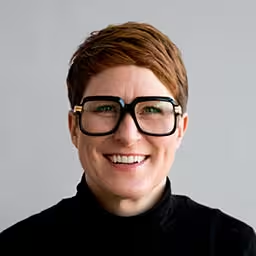
Kate is an award winning designer, creative director and founder of Kate Dawkins Studio. A studio specialising in creating and delivering bespoke content for spectacular live performances, shows and brand events, working across both projection and LED, indoor and outdoor.
Kate has many years of unrivalled experience in designing and delivering distinctive visual content for some of the largest global brands, from the giant 360° ‘Audience pixels’ for the London 2012 Olympic Ceremonies, to Adidas, Samsung, Jaguar Land Rover, Elton John’s Las Vegas show and Fast & Furious Live.
She believes in creating stunning design-led visuals that engage and delight the audience. Applying logic to the problem, passion to the solution and a meticulous attention to the final outcome.
Talk: From World War 1 to Fast & Furious Live
Kate has designed and directed content projected onto a floor of ice, the ceiling of the London Design Museum, the bridge of the USS intrepid in NY and put content onto the smallest LEDs to create one of the largest screens for the London 2012 Olympics ceremonies. 2017 in particular saw two diverse, exciting and extremely complex projects!
It goes without saying that each project requires a unique approach. But that approach encompasses so many variants. These large-scale projects are inevitably a roller-coaster ride of design, decision making, blood, sweat and sometimes, just sometimes tears!
Kate will be going behind the scenes, To give an insight into the influences, processes and the challenges behind these kind of projects.
Transcription
[Digital music]
[Applause]
Kate Dawkins: I really wanted to come on stage with the glittery wig and the glasses, but I wasn’t sure I would manage it in this heat, so apologies for that.
Hello. It’s absolutely fantastic to be here. There have been some incredible speakers. The pressure on me now is immense, so bear with me. No, it’s been really brilliant. I’m sure the other two will be fantastic as well.
My name is Kate. I run a self-named studio in Hackney in East London. Just for dina, I have--
[Laughter]
Kate: --amended my business card accordingly because I agree, you know. As I say, self-named studio. What we do is we design, produce, and deliver digital content for live performance shows and brand events. We reside in two shipping containers, that look a little bit like this, in a place called Hackney in East London. This is the view from outside, across, and this is the view looking out, which I’m only showing you because the chances of ever seeing a blue sky in London aren’t very high, so that was a good picture that day.
Now, I know that some of you in this room will know each other, so I think, first of all, what I’d like to do is tell you a few things about me, so we can all be one big, friendly room. I’m going to start with the most obvious things. I have a collection of these glasses. I’m slightly obsessed with them. I do need to stop buying them, and I also believe they were designed in Germany, so thank you for helping my obsession.
I also have a ridiculously and unnecessarily large amount of Nike trainers. Other trainers are available. It’s not just Nike. Today, I have put a special gold pair on for you. So, if the talk is terrible, you can just stare at the trainers instead.
Scrappy dogs, l love scrappy, little dogs. Sadly, I can’t have one because of my job.
And, I love traveling, which is just as well because, otherwise, I wouldn’t have got here.
Another thing I love is true crime. I’ve yet to commit a murder. I don’t think I’m going to. But, until that point, I keep reading, watching programs, and I’m slightly obsessed by it.
Another thing, just going now onto a more creative introduction, I have been, for the last couple of years, taking pictures of toilet signs. Now, the toilets signs -- one of the things, as a design, one thing I’m not allowed to do is I’m not allowed to make any judgment about these toilet signs. If they’re interesting, I have to take the picture. All of them, obviously, are very well designed, and then others are not necessarily so, like these.
Audience: [Laughter]
Kate: Then I found these, which is really interesting. I don’t know. You may know this. I have asked it before. Does anyone know where these might be?
Audience member: (Indiscernible)
Kate: What was that?
Audience member: McDonald's.
Kate: McDonald's, yeah, absolutely. I walked in and I was just like, “Wow. That’s very strange. A very strange toilet sign for a McDonald's.” Anyway. Of course, very badly taken, particularly the men’s, because I didn’t want to look like I was trying to climb into the men’s toilets -- the signs from here.
The irony of the title of this book is not lost on me, but this is not why I’m showing it to you. These are Pelican classic books. I have a huge collection of these. The reason I collect them is mainly not for their scintillating content. As you can see, I left the one that just says “Dying” out of this because I thought it is a bit hardcore. But, it’s very much about the graphic design. It’s beautifully, beautifully simple designed covers, bright colors.
I think, you know, that’s something I love, as you can also see in another thing I collect. Again, a lot of these are German, German geometric toys. I think you can see, if anyone has seen me over the last couple days, you can see that, obviously, I wear a lot of color. Honestly, I love color; clearly.
Another thing I collect is books, strange old books, on geometry and optical designs. And, my favorite artist is Sol LeWitt. I think you know where we’re going with this now. You’ve got a measure of me - bright color, big, bold graphics.
Another side project I like to do when I have the time is, I take these dice, and I take a preordained, pre-set structure, a formula, and I create these, which are very geometric pieces of art. Terribly naïve when you saw Jared’s wonderful stuff yesterday. [Laughter] I’m almost embarrassed showing them, but I’m going to anyway because I like them.
One thing about me; I’m a Libra. Now, I really don’t care two hoots about star signs, but what I think it does mean is that, on the one side, I’m this person, and then I’m this person. I think, slightly schizophrenically, I am two people inside. I’ll do things like, I’ll sit in my studio and it will look like a complete and utter mess. Every now and again I’ll go, “Oh, I can’t deal with this. I have to have it totally cleaned up.” I think there’s a sort of schizophrenic thing going on.
I did say. I did say to you that we had a slide that was pens. I’ve got these pens. The reason I’m showing this is not in the instance that we like pens, but because my education was a fully analog education, and my career has been a fully digital career. Well, combining the two, actually.
I obviously don’t have this computer anymore. The reason I showed it is because this is my very first computer.
I think, having an analog background, it meant that when I was doing my degree that everything was very handmade. All the mark marketing was made by hand. What it gives you is it gives you time to really consider what you’re doing.
Here’s another spread. All of these things were cut and paste. They had to be printed out onto tracing paper or similar, and all hand-posted into this to get where you wanted to. It gave you time to think about what you wanted. It gave you time to consider because, quite frankly, there was no Command-Z. Command-Z was starting again, so it really gave you time to think about what you were up to.
I then started combining my love of typography with the more digital output. I got a digital camera. At the time, I was doing lots of things, again, like cutting and pasting, printing things out on tracing paper, layering stuff, not really knowing what I was doing, but I was creating these images. What struck me recently -- well, actually, when I put a talk together some years ago, really, it was how this was very similar to a storyboard. You started to see a means of sequential images, which I didn’t realize at the time I was doing.
Again, this is some of the work. It was a time when there was a forefront where typography was really shifting away from really beautiful, rule-driven typography into this really distressed, breaking all the rules typography. There was an agency in London called Tomato at the time, and they were doing this work. We were all jumping on this rule-breaking stuff.
There’s some more stuff. We’re talking about 1994. What I wanted to say was -- someone from Adobe may tell me that I’m wrong here. [Laughter] These were the two, Photoshop and Illustrator. These were the two programs I was using in 1994. Now I can use Photoshop badly, so I’ve regressed, not developed my skills.
The reason I’m talking about that is because they were the only programs I could use. However, I didn’t want those to stop what I made and how I made things. Again, it’s a desire to want to create, not really knowing how to do it.
This was a total sequence I did for a program on the BBC. I really wanted a structural, 3D type, but I didn’t know how to do 3D type, and there were hardly any programs out there at the time doing that. The only way I could it, and this goes again back to what dina was saying yesterday, is I had to go into Illustrator, and I had to output, incrementally, each bit of type into a sequence so that I could animate it. It’s not the most -- well, it was incredibly time-consuming. It’s not the best use of time, but you got a very interesting output.
Again, this is a video for Primal Scream’s Autobahn 66. We had an edit. We’d done the shoot with Primal Scream, and we were just looking at it. It was just like, oh, really, there’s something missing from this. Pictures of Bobby Gillespie, and we’d sort of included this. We’d done a Guerrilla style shoot in a car where we nearly got arrested because we had a camera sticking out, going into the city in London.
We did this edit, and they were just like, “Yeah, it’s totally missing something.” We went out to the pub at lunchtime and had a beer, trying to mull this problem over. We’d been doing, again, experimenting with all this, just how to make marks in a different way. We’d been doing this feedback stuff.
I love all this up here. This is the sort of thing that I’m messing around with.
We’d been doing video feedback, and we thought, “Why don’t we do this? We’ll plum the whole video straight through the thing and film it back off,” and this is what we got.
[Primal Scream singing “Autobahn 66”]
Kate: That was quite a low budget video, so a lot of that was coming from stock footage, but it gave us the result we wanted, which was this psychedelic output, which was obviously well received at the time.
Just on that one of just trying to find ways of creating marks where you may not necessarily know how to do something, this was a project I did with a London-based agency called 1.0, who some of you may know - great friends of mine. We were working on a project for Nike relaunching the Nike Telaria Zoom. The whole thing was about its lightweight capability, its speed ability, and the rest.
We were creating images for social media, GIFs, and images for Instagram. There’s some more.
Basically, I was messing around on my phone with an app called Glitchy and started doing these things. I was like, “Wow. That’s exactly what I wanted to do.” But again, dina was saying, I didn’t have -- at the time, the app didn’t do moving images. It only did stills.
Again, I got my iPad out and some masking tape, and I stuck some tape down and put some incremental marks on it. I kept shifting the thing until I got a sequence, which made these.
I’m not for one minute saying the final output was created on an app on my phone or an iPad mini because this was Nike and they wanted it to look better. [Laughter] It actually was -- we had to go into Cinema 4D and redo it but, again, it was the idea. Sometimes things are not where you expect them. The answer to creating something is not where you expect it.
Just running back into where I’ve come from, my background was very much in the TV-based broadcast. I directed TV commercials. I directed title sequences, so very much a broadcast background.
I also directed music videos--you see the one for Primal Scream--and some other strange people. I won’t even tell you who they are because you won’t know them.
One of those videos, though, was for Elton John. It was a rerelease of his 1970s track, “Are You Ready for Love?”, and I will give you a little bit of it.
[Elton John singing “Are You Ready for Love?”]
I’ll write a symphony just for you and me if you let me love you. I’ll paint a masterpiece just for you to see if you let me love you. Let me love you. Are you ready? Are you ready for love? Yes, I am. Oh, yeah. Are you ready? Are you ready for love? Yes, I am. Oh, yeah. Are you ready? Are you ready for love?
Kate: That’s nice. Elton after lunch. That’s what we all want.
You know I think what was interesting about that, and again it’s in a much longer talk, but it’s all the assets to make that video. Some of them, the backgrounds were scanned from those books you saw earlier. All the type was scanned from an old type book. The whole thing of needing it to look like it was the from 1970s was really important because we didn’t want a digital output.
The reason I’m showing that, though, and I love the fact that I show it at the size that it actually is because it just looks like a postage stamp now is because, as Jared suggested today, I think a career angel came down, picked me up, and gave me a massive kiss because that was seen by U.S. photographer David LaChapelle who is famous for his hyper-real and slightly subversive imagery. There’s one of Elton there.
He had been asked to art direct Elton John’s Las Vegas show. He saw the music video, and he said, “We need these people to create all the visuals for the show.” As they say, “The rest is history,” because I went and created all the content for this, and I didn’t know what I was doing when I was doing this because this was much bigger than we’d ever worked on. I jumped on it. I was like, “Yeah, I can do this. This is absolutely fine.” [Laughter]
Audience: [Laughter]
Kate: God, I’m glad I didn’t know of some of the stuff I know now but, you know, an amazing project to do. And, as I say, I never looked back.
But, we’re still talking about a 16-line screen. Albeit a very large 16-line screen, it is still the proportion of a TV.
Then, we went on to work on the MTV Music Awards--this was a piece of Fu Fighters--which we’re now getting into a much more spatial environment, so we’ve got now a back screen, a floor screen, so we’re now considering a much more 3D environment, which was great fun.
Robbie Williams, Close Encounters Tour, that again through up difficulties because you’ve got this very strange structure--I’m not sure it looks very good, actually--and these high res and low res screens to work on.
Then, in 2008, after 13 years of the only job that I had, I left. I decided to leave and was going to leave. Sadly, three days afterward, I walked straight into a recession. I suggest if anyone has got the thinking of just walking out of their jobs, really do think about it because I hadn’t thought that through carefully.
That has allowed me to work and freelance on some incredible projects, working on some very, very difficult surfaces, so a projection on the bridge of a ship.
These are 16 double-sided, automated panels that we were projecting on, which they were either side of--I like to call--car walk. This was for Toyota. Also, all of that was automated with the movement of the cars, including the content.
This was an interactive project for Adidas.
Basically, I was also very lucky to be asked to work on the opening and closing ceremony of the London 2012 Olympics, particularly creating the content for those. I don’t know if anyone knows there were pixels on each of the seats.
I now came to--what year was it--2016, I think. I’m running out of years. I decided that I could do this on my own. I’ve decided I’ve got my confidence behind me. I can do this for myself, so I set about starting a studio, not in the way anyone should start a studio. I think the whole idea of setting up a business plan and really working out what you’re going to do was not the way I did it. Again, I should stop going to pubs because a lot of these things are based on doing it over a pint of beer. It was like, “Yeah! I’ve got a new business card. Let’s start a studio.” That was the way I did it.
The whole thing about our work and our studio is, it’s about process, craft, vision but, ultimately, about the audience. I always like to think that all the work that we put into these projects, they are glued together. It’s the final link in the chain when the audience actually sees it. We see it over and over again, and sometimes we get bored when we’ve seen it, and we create all this work for it. Then the magical moment happens where you’re standing there, and you’ve got a live audience. You see it through their eyes, and it is just the most beautiful thing. They are definitely the final link.
Now, the title of the talk. I have two projects that I worked on last year, two incredibly big projects that were worked on simultaneously. One I won BAFTA for, the other one I didn’t. You could probably guess which one it was. [Laughter] But, I’ll let you go because you don’t actually know, do you?
I’ll start with the first one, the Passchendaele Centenary Event. What was funny, over lunch we were talking about this, and Yan tells me that Passchendaele is now a name for cheese, so we’ll just go with the 100 years of the cheese event.
No, seriously. Passchendaele was a battle in the first world war. It was a particularly horrific battle for all sides, and it was the BBC and the Department of Culture, Media, and Sport wanted to commemorate this event. This is our building. It is in Belgium in Ypres. I think it’s an important factor that this actually was a very pinnacle point for this battle. It wasn’t just a building that they went, “Oh, that building looks good. It’s huge. We’ll use it.” There was a thinking behind using this building.
Just to go onto that, this was it before, and this was it afterward. Like most parts of this, things were destroyed really badly. Of course, this was a famous Frank Hurley picture of the land and the area during this war.
This is our building from top down. You can see. I’m not going to use the laser pen. I’ll probably do something to the thing. You can see the size of the building and the area that we had for the audience to stand in.
This was a pitch, so I threw myself wholeheartedly into this. I don’t often do that. We don’t normally have time, so we don’t often pitch, but the stars aligned, and I had time to really push the ideas on this one, and it was fantastic.
I think, just summing what was really important about this particular project is that we had to consider the constant connection, not just the live audience, but this was going to be broadcast on television, and they are two very different audiences. I wanted to break away from the normal building projection. I think we’ve all seen snakes going through windows, bouncing balls, and buildings being sawed in half and falling apart. This was not the time for that particular look. It was very much about moving away from those attitudes.
We wanted to be sympathetic to both--sorry, that was the one I was saying--the audience at home and the live audience.
I should read what’s in front of me, really, shouldn’t I? [Laughter]
The fact that it was about history and not theatre, we had to be very careful not to make this less than it was. I think, like any event, it needs to have highs and lows, large and small light and shade. What we wanted--and I won’t read this out because you can read it for yourselves--you can see the kind of things we wanted it to be and what we felt it shouldn’t be.
Just going through the work that we were doing and looking out, and the things we wanted to look at to get to where we needed to be, I reached out, looking at a lot of mood imagery and a lot of theatre and a lot of stage sets and things like that. I think there’s something wonderful about working in this world is about perspective and scale. I think there was a thing as well that I love about these buildings is about not needing to use the whole surface; about using just a small part of it and not being scared to really focus down on a beautiful image.
Another thing we needed was photos, letters, and poetry. They were going to be a big part of this. Again, I didn’t want to put just type or some letters on the building. We wanted to be careful that we were using it in a really good way.
Did you need to read it? Do you need to read the handwritten type, or can it just be big letters? All of these things were considered: how we were going to use archive imagery and create layers, how to create some intrigue.
But also, this building, this event was about live performance. It wasn’t just about projection mapping. There was going to be theatre. There was going to be musical pieces. How do we use the building to support these?
One thing I absolutely love is this sort of abstract. I think I always reach towards abstract. I wanted to be able to, again, use this; not be scared to use this building in a simple way. I think the red line up there is the most beautiful thing when I found this. It was like, how beautiful to just have a red line across the building, as simple as that?
Again, this was about terrain and walking to light. It was looking at all these things.
But also, the event was very much about a younger generation. They wanted a younger generation to go forward and remember history, so we were looking at how we could have a digital aspect to support this.
Then I found this image, and I love this image. It’s very much about looking out, looking in. This was the actual building. I think it’s very stunning, so I started looking at it thinking, “Well, hang on a minute. That looks like the building. It looks like the windows of the building.”
I designed this frame for our pitch, and I told the client that we could do this. I didn’t know we could do this. But, as I say, never let the truth get in the way of a good pitch. So, I said we could do this, and we did manage to do this. This is a slightly out of soft picture of the final event, but we did manage to pull that off. Thank God, after I said we could.
Again, we were using a lot of stuff. Like I said, what do we do with it; how do we create this beautiful, layered stuff? This is what we actually ended up doing.
This one I loved. I found this. This is obviously not one of our images. I found it, and I use images just to tell the stories and sell in ideas. I loved it. The simplicity of this woman whose, clearly, husband wasn’t coming back.
We designed this frame. This was part of it. There’s a story that goes with this, which I did when I told it the first time, I was never saying it again, but I’m going to continue saying it because I still think it’s funny.
This is the animation. We had a great hand-drawn animator working on our team, and he created this. There’s this beautiful animation.
Just going back, we’re standing at the event. We’re watching it. Obviously, this is an incredibly sad event, like most historical things of this nature would be. I turned to my husband and said, “That’s Pete in a dress.” This was our best friend who had used himself to model. He used himself for the film to model this thing, and I think my husband sort of spat some beer across these poor people, and I was just like, “Oh, geez,” that was really bad timing to tell that story.
Just going back to the line, this is again a beautiful line. The whole line of Red Cross, the line of life. Why not use a massive great building and have a bright red line across it?
This is what we did. We had the Red Cross. That’s actually a live feed incorporated into the building.
This was, I believe, also I was told, the image that sold or won us the job. Again, this is the one you saw earlier in the mood imagery. We felt that -- I saw this, and all I could think of was the lives, the lost lives, and how beautiful it would be to have these just going up the building. The client loved it. The client was like, “That’s absolutely beautiful. It’s very sensitive, very touching.”
This is what it looked like, and I think I’ve got a small piece.
[Voices8 singing “Tavener: Mother of God, Here I Stand”]
Kate: You can see how beautiful that worked. Another thing was, obviously, the building was destroyed, as lots of buildings were at that time. As a said, a lot of things people do with projection mapping is break the building up. So, when the client said, “We want to destroy the building,” I groaned and said, “Really?” But, in this case, there was a very good reason for it, and so we started looking at ways that we could actually do that.
I found this on Vimeo, which is just the bizarrest thing ever. You can just see at the bottom, but someone had taken a model of our building called Fallen Ypres, and they’d modeled the destruction of it. I was just like, how -- I still don’t know to this day why someone did this, but what it did was give us a good background and basis for us to do it.
This is part of it. We started working on this. Unfortunately, there was a very awful fire that destroyed a building in London called Grenfell Tower, killing lots of people at the time. We basically had to very quickly unpick this animation to make sure that didn’t look like the building was burning. That was a hard and very tense moment.
Just going on to the technical side of projection mapping, I don’t know if anyone -- are there people in the room who have done projection mapping? No. Okay. [Laughter] I’ll carry on then.
Basically, when you do a building such as this, you have to have a scan. You have a Lidar scan made. What that gives you is an incredibly intricate model of your building to work with. Then what happens is the technical company give you this back. What I was thinking is it just looks like a sewing pattern, but it gives us something to work to, and this is what all our animations have to fit in.
There you can see this is a still from one of our animations. That maps back onto that. Then the media server that sits between us and the projectors wraps it all back around the building, and it looks like that. That, in a nutshell, is the sequence of events to get a piece of animation onto a building. Obviously, it’s not quite as simple as that but, for this purpose, that’s the process.
Just on a level of projection, if you’re going to do projection, it’s a great idea to do some tests. Normally, you would factor that into your budget. In this case, it wasn’t factored into that budget. Therefore, the technology company had to go out in a van, wait for it to get dark, wait for them to turn the lights off, and open the back doors and shine some projection onto the building. That’s not normally the best way to do it, as I say, but that’s how it worked in this instance.
I just thought I’d put this in. I saw this, this morning. I was looking for something. This is some of the cabling coming out of the back of the media servers to make all that happen. What I want to know is, who is the person who knows where each one of those cables goes, where it starts and ends? It’s just ridiculous.
On that projector front, this is the projectors. There were seven towers: 58 projectors, 7 towers, 133.632 million pixels of content, so a very, very big surface. I don’t know if there are a lot of big projection in Russia. I do believe it was one of the largest building projections in Europe.
Anyway, what I’m going to do is play you a short film, which will cover up and fill the holes for everything I’ve forgotten whilst I was talking through it originally.
Narrator: On the 13th of July 2017, thousands gathered in Ypres Market Square in Belgium to commemorate the centenary of Passchendaele, the Third Battle of Ypres. The story of this battle was told in a spectacular show of projection mapping, live theatre, and musical performances with the formattable Cloth Hall acting as a dramatic and poignant backdrop for the proceedings. The event aimed to communicate to a contemporary audience the historic significance of this particular battle.
We were responsible for the design, animation, and delivery of the projection content. And, with our canvas standing at 125 meters by 70 meters, it wasn’t an easy job. To add to that, our main viewing point was three-quarters onto the building. So, as well as having to deal with this complex angle, we also had to overcome the ornate and uneven surface of the building.
Previsualization was vital to the project throughout, so we used special software and VR, which allowed us to quickly review our design and animations on a model of the building. Design conversation and craft stands at the heart of our studio. We wanted to make sure that each story had its own voice and set the right sensitive tone to establish steady flow and visual storytelling, but with a modern aesthetic.
We had incredible access to archive footage of the veterans, as well as photographs of the soldiers and their families. Every piece of handwriting was taken directly from the soldiers’ original letters, as authenticity for us was paramount to this project.
Lighter moments came in the form of theatre and live performance. But, one of the most powerful moments of the event was the soldiers in the windows reflecting just how many soldiers had marched through Menin Gate never to return. Alongside the 8,000 guests, it was broadcast and watched live by an audience of 1.5 million.
Projects like this just don’t come along very often. It was truly an honor and a huge sense of pride for our small studio to have been selected and to work on such a remarkable and poignant event.
[Applause]
Kate: Thank you.
[Applause]
Kate: That is, of course, the one I won the BAFTA for. And, the reason I put this picture in is not because I’m showing off; because I’ve had several comments back about this picture with someone saying, “I’ve never seen you so happy.” [Laughter] The reason I put it in is to remind myself that, yeah, there is true happiness there.
[Applause]
Kate: I’m going to say quickly -- I’m running out of time -- what I wanted to say is these shows is, it’s not about me. There were so many people involved in these shows. It’s so important that we remember that this is such a group approach to these things and not one single individual is able to create this. We do end up, all puns aside, fast and furious, puns aside, as one big happy family, unless the show is going wrong, and then we’re not one big happy family. We’re all actually calling each other everything and walking off in a huff.
As I said, our studio is very much a collaboration. The studio is very small. It’s me, and I have a producer by my side. I like it that way because what it means is that I can collaborate with other production companies. I can collaborate with talented individuals, whether they be from the audio side, animation side, or illustration side. I think it’s really important to invest in new and inject new and interesting people into the projects.
We, of course, have technology companies as our partners. Otherwise, we wouldn’t be able to pull these ridiculous projects off. But also, I know this is -- anyone who has listened to me rant over lunchtime would probably say, “You should remove that out of your presentation,” but I do believe that we aren’t suppliers. We are very much partners with our clients and we’re there to help deliver the job to the best it possibly can be.
In fact, the Passchendaele project, when we finished, the client said to me, “Thank you for loving the project as much as I loved it,” and I don’t think you can get more of a compliment than that.
I just wanted to leave you on a quote that I love, I cherish, I try to work to, and that’s, “The greatest danger for most of us is not that our aim is too high and we miss it, but that it’s too low and we reach it.”
Thank you for listening.
Audience member: Whoo!
[Applause]
