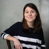
Oliver Schöndorfer is a renowned typography expert and freelance UI & app designer from Austria. He is obsessed with everything type, feels physical pain when spotting bad kerning, and even had to switched banks, because he could not stand an updated logotype.
His vision is to make digital projects more successful and beautiful through type. To share his knowledge, Oliver hosts the popular YouTube channel Pimp my Type, runs the weekly Font Friday Newsletter, writes articles, speaks at conferences and podcast. His energetic, unique style sets Oliver apart, while motivating thousands of designers and developers to leverage the power of typography.
When Oliver is not thinking about letters, he practices Yoga daily, enjoys hiking with his wife Birgit, takes care of their three girls, and manually grinds coffee to keep it all going.
Typographer vs. Accessibility
Designing for accessibility sucks 😩! It is limiting creative expression, making things look ugly, and is mostly for the blind anyway. But is that really true? How can sublime typography and accessibility go hand in hand?
In this talk, Oliver confronts himself with his own misconceptions as a designer and type nerd. Is 16 px the required minimum font size? Is high contrast necessary? Should you really avoid serif typefaces? And is Comic Sans best for dyslexic readers (while being the worst for everyone else)?
In a fun, engaging session, Oliver takes an often overwhelming and fuzzy topic for creatives and breaks it down. You will walk away inspired 🤩 with practical guidelines on how you can set the text of your next design project beautifully accessible, to reach and convince more people.


