Noma Bar
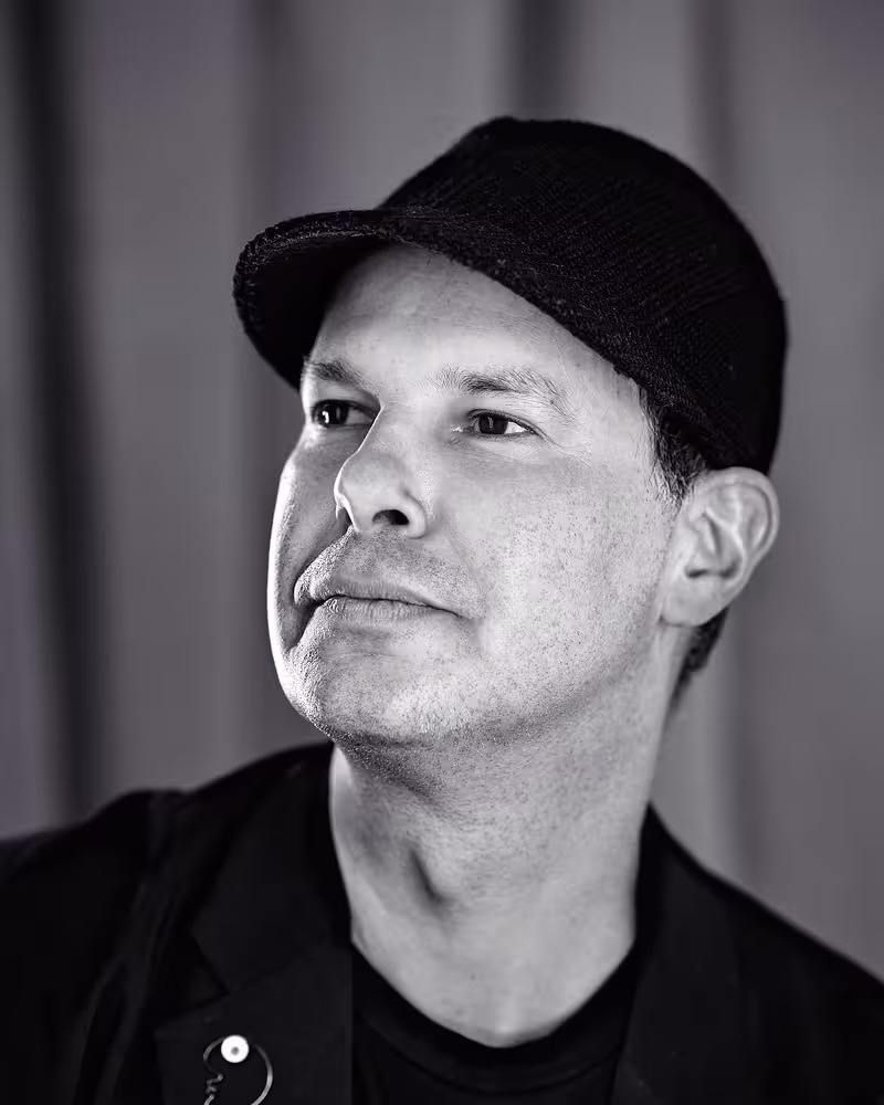
Noma Bar (born in 1973) is an Israel-born graphic designer, illustrator and artist. His work has appeared in many media publications including: Time Out London, BBC, Random House, The Observer, The Economist and Wallpaper*. Bar has illustrated over one hundred magazine covers, published over 550 illustrations and released three books of his work: Guess Who - The Many Faces of Noma Bar in 2008, Negative Space in 2009 and Bittersweet 2017, a 680 page 5 volume monograph produced in a Limited Edition of 1000 published by Thames & Hudson.
Bar's work has become well known throughout the world, winning many industry awards; more recently a prestigious Gold Clio for his animation & direction work for the NewYork Presbyterian Hospital, a campaign to highlight new frontiers in cancer treatments.
He has also won a Yellow Pencil award at the D&AD Professional Awards and his London Design Festival exhibition 'Cut It Out', was selected as one of the highlights of the festival. The project was nominated in the graphics category for the Design Museum, Designs Of the Year.
Talk: Graphic Storytelling
Illustrator, artist and designer Noma Bar is going to guide you through his extensive career and famed pieces. Process and inspiration, personal and commissioned projects and much more are playing into this.
Transcription
[Music]
Noma Bar: So, I’m going to start. I'm very happy to be here, as everyone said, after two years of a Zoom talk when everybody needs to mute themselves, and I don’t have any feedback from the audience. So, I’m very happy to be here, and I’m just going to introduce myself.
My name is Noma. I was born in 1973 in Israel. You probably know the complexities in Israel and the conflict between the Arabs and the Jews. Because of that kind of constant conflict, I had to go to the Army, and I served from the age of 18 to 21. I served three years in the Navy. And I was a sea navigator.
Straight after that, I went to study graphic design and typography. And I studied in Jerusalem. And straight after that, moved to London. And that was 2000, before laptops and digital portfolios and websites, so I came with a portfolio, a physical portfolio with my work.
Most of it was in kind of Hebrew typography, and I started to send it to different agencies, and I didn’t get a reaction. And I realized that no one needs the Hebrew typographers in London.
I was living in a small bed and breakfast. It’s like a small hotel in central London. And I recreated something that I did when I was 17 years old.
Israel was in war with Iraq, and we had missiles that came from Iraq. And we would be sitting in a sealed room with gas masks. And I remember myself looking at Saddam Hussein’s article about the fact that he’s using radioactive materials on his own people. The same thing that happened these days in Syria.
I did this kind of around this radioactive symbol that illustrates the article. And, suddenly, the eyes, the radioactive symbol becomes eyes and mustache. And I recreated it when I was in London and started to send it to The Guardian and different various newspapers, Timeout.
Straightaway, I got a response from Timeout, and my first illustration was published in 2012. And it was Shakespeare, “To be or not to be?” That’s why there’s a question mark.
But it was also a story that revealed facts and things that people didn’t know about Shakespeare. And that was my personal, “To be or not to be?” so it’s kind of one of my favorite illustrations.
Things evolved straightaway. I got a meeting with the creative director of GQ, and he told me that they’re doing a story on Michael Jackson, and they want to approach the story from the mothers, from the mothers that started to know that Michael Jackson is a pedophile. But the fact that the mothers were leaving the baby with Michael Jackson.
I remember that I went to the toilet to wash my hands, I saw this pictogram. I took a photo, and a few days after that become the solution of Michael Jackson.
[Audience laughs]
Noma: So, a lot of times I have sign language and the signs are all over. I all the time look at walls, and I look around me. And everything kind of serves me. And at some point, it comes as an idea and I execute it.
Or another example of something that you probably don’t want. It’s like ten minutes before sending an illustration to The Guardian newspaper, my computer crashed and I lost everything. And I did this drawing kind of around the apple. It looks like someone is screaming.
But a few years after, the same principle started to become Steve Jobs’ portrait for Wired magazine with apple and the leaf that goes up.
And in 2007, I had the kind of good collection of work, and I published my first book, which was called Guess Who. Charlie Chapman is my hero for telling stories without words, and this is what I do. I’m a storyteller, but almost using a visual pantomime language. I don’t use speech bubbles, and I don’t use typography.
I went to the opposite of what I studied, in a way, which is words, because I came to London, and I lost my language, and I couldn’t express. And also, Latin letters, it didn’t hit me in the stomach the same as the Hebrew letters. And I really went to this kind of pantomime language of expressing myself with words and symbols and iconography.
Bob Dylan for Timeout, that was a story of Dylan using the electric guitar for the first time on his show because he was known for acoustic.
Pulp Fiction. Stallone, Rocky. And my process of creating portraits, I look a lot in the mirror, and I mimic the person that I’m illustrating. I’m trying to capture iconic moments. For example, this one, you can see that he’s screaming, “Adrian,” or something, you know, when Stallone’s lips are kind of stretched up. And I’m looking for this kind of thin because we all have two eyes, a nose, mouth, and that’s it. But we’re so different from each other, and this is something that I’m looking all the time, these points, little points of difference. The gap between the nose and the eyes, the mouth, or the space between the eyes.
This is Spock, that you talk about.
[Audience laughs]
Noma: I’m inspired to things like Spock, to reduce more and more, and it doesn’t work straight away when I start. It can start with a hand drawing, and it’s going to be a realistic drawing. And then I start to strip it down, and I’m just looking for one element that will tell the story. And for me, again, this is kind of a good example of what I’m looking for.
It’s also brief. For example, this is a brief that was including ET and George. You can see a dinosaur in his beard as well. So, it’s kind of talking about all his films. So, sometimes it’s not just one element. If the brief requires a lot of elements, I’m using kind of a more busy portrait.
[Audience laughs]
Noma: Tarantino. That was about Kill Bill, and the violence in the Tarantino films. As you can see, I don’t copy photos. I look at the person. I have a memory that I don’t know what’s happened there, but when I start the work, I remember the essence of the face. And Tarantino has this kind of Popeye face, a little bit folded, and I exaggerate it, but his face also broke the sword. And you can see a hand with blood on the top.
That’s another thing that I’m looking. I’m staying away from -- I put in brackets -- “fucked,” in a way, so just what I need and every element needs to be part of the story. So, I’m staying away from the creative illustration or things that are not necessary to the illustration.
That’s another Pulp Fiction, and it’s a good example to show some. It’s kind of the same film, but completely different approach. You can see Samuel L. Jackson and Tarantino.
Kurt Cobain, that was about his music.
Amy Winehouse with heroine. I used to live in Camden Town, and I used to see her buying drugs opposite my window, and this is how -- so, it’s not a commissioned work. This is something that I was actually looking, and this is how it came.
But in the time when I lived in Camden, I don’t know if you know London, so there is a lot in the area of Camden. There’s a lot of goth, goth guys with black eyes and black lipstick and white faces. And this time, when I lived there, I started to lose the face, and I was looking for something very gothic of just floating eyes and mouth. And where you live in your environment really, really inspires on what you do.
David Bowie, and that was on music and Barracks Street. It’s in London, so it’s about the record scene in the ‘60s. That’s why I’ve used the record and the needle of the record.
Audrey Hepburn about style.
That was my first cover for New York Times, and it was about accusing the paparazzi on Diana’s death, so you can see a camera, and all the face has actually happened from the camera, and you can see the crushed car.
I’m sorry that I’m revealing you all this because normally it takes a bit of time to digest and discover, and I’m kind of killing it when I’m telling you everything. But just stop me if I’m revealing too much.
[Audience laughs]
Noma: George Floyd. So, yeah, you don’t need -- I don’t need to explain this one.
I don’t need to explain this one.
[Audience laughs]
Noma: I think I’m going to have a whole book on Donald Trump.
[Audience applauds]
Noma: Such a great character. I’m really missing his personality.
[Audience laughs]
Noma: And I think I have ten portraits of Donald Trump for New York Times, Guardian, and all of them are different. You know this is Donald Trump in Asia.
[Audience laughs]
Noma: So, again, the brief, really that was about Donald Trump using Twitter, obviously, but the brief takes the illustration to a different place.
You know this guy. And you can see two dead people on his lips and two bombs and two airplanes.
And another Putin in a different time, a different story. That was about Putin’s behavior and Putin’s strategy. And at this time, he was just a snake and not a killer.
This one is for Coca-Cola in Trafalgar Square. When I worked with Coca-Cola, one of my rules is just to use their bottles. I love their bottles and their just timeless shape, and I use it all the time. So, you can see they’re all made from Coca-Cola bottles.
This one was for Bafta, which is -- I don’t know if you know -- like the British Oscars. And so, this is something that I started a few years ago and now they’re using illustrators every year for the posters and for their brochures. And it’s really fun to work with Bafta. And it’s something that I’m very happy that I did because it opened it to a lot of other illustrators.
At the same time that I was doing portraits, I worked with magazines and newspapers on completely different subjects. And in 2009, I published Negative Space. That was my second book. I don’t know if you all know what is negative space, but it’s the space around us. This is negative space as well, so it’s something that I’m exploring for, I think, 20 years. It’s rooted in my work, negative space, and I’m using it.
Here you can see a dog that eat a cat and cat that eat a mouth, and that was the cover of the book.
It’s a selection of kind of really difficult subjects from death and depression and crime, but there’s something in the illustration that gives them a bit of hope and smile, and that’s what illustration is doing compared to photography, which just shows reality. There’s magic or imagination in illustration that can take the subject to a completely different area.
That was the back and the front of the cover of the book.
And a few spreads from the book.
This is about American soldiers, what they’re doing when they’re not fighting in Bosnia, so it’s made from an Army pattern.
And a lot of stories on 9/11.
At the same time, I started to go out and explore, and I moved to galleries. And this is something that I’m still doing, and I love to work in spaces and present in galleries, so it’s a completely different format from newspapers, and it gives me different opportunities and different executions.
That was my first exhibition in London in Hoxton Square, which is a mix of cutouts and screen prints, and I started to work with wood and metal.
That’s a confused hedgehog that humped a chainsaw, but it sits on the floor, so it’s got a very long bar, and the chainsaw is at the end.
That’s from my studio. And there’s a lot of challenges in 3D, so when I do 3D, I do a real 3D, so that’s - I don’t know - like a 2-meter balloon that balanced on a needle, which is a nightmare to create something like that, but I managed to do it. So, it sits on a pedestal and the needle is that long and the balloon sits above it. And the one on the left, you can see a match there, which this was called “Burned Out” and this is “Pop Out”.
That’s from my talk in Paris.
In Italy, so I kind of fall over with exhibitions, and I’m presenting in different spaces.
That was in the Baltic Center in UK. This one happened in the Wood, if you can see a dog in here, but you can see another dog sniffing his back.
I was sitting in Highgate Wood in London and, suddenly, I saw a black Labrador and a white male Labrador was kind of sniffing the back, and the female Labrador lifted her tail. And, suddenly, the owner was pulling the dog, and the tail was kind of stayed up.
I really love this moment of the dog was there a minute ago and, suddenly, disappear and just the tail was hanging. And again, this is kind of moments that I’m looking for, this existence and not exist.
In life, death, it’s there, it’s not there, and I sketch it. When I see things like that, I normally sketch them straightaway in my sketchbook.
Or another example, when I came back from a talk in Brighton, and I was sitting next to a drunken guy on the train. I don’t know if you’ve been in the UK, but you can see, like properly drunk with vomit and McDonald’s all over and ketchup.
But suddenly, the train stopped, and there was light outside. And it was so beautiful because all the features and all the disgusting bits on this face disappeared.
[Audience laughs]
Noma: And it looks like the moon that protects him. So, if you look from the left, you can see a moon, and you can see him on the right. But a kind of horrible situation that becomes beautiful, and I sketched it.
A few years ago, I realized that I don’t need to print. My works are so simple that I don’t need to use ink, and I was looking for a solution.
This is Flora. That was my solution. Flora is my dog. It’s a 750-kilos dog with a hydraulic engine in the belly and hydraulic neck and handles as teeth.
Flora is cutting my work in a very strong power from 4 to 20 tons of cut. Very physical and very... It’s now doing what the laser is doing. It doesn’t leave any bleed of fire.
It took me six months to develop it from jumping physically on the blade and putting weight to see how I can cut thick paper, and it’s not easy when it comes to large paper. In a way, it’s doing what a cookie-cutter is doing. I’m just kind of cutting my work.
This is one of the die-cuts, so you put the die-cut. I’ll show you.
That’s a wall from one of my exhibitions, so I don’t need to be there. I leave empty paper. You come to the gallery. You buy empty paper. You can choose the die-cut. You feed the die-cut and the paper in the dog, and you press on the teeth. And you get a print, so you can choose.
You can bring your own materials, so you can do a mix and match. So, these are all kind of materials that people were bringing from Oasis record sleeve to David Bowie, and they’re cutting it and kind of creating. And, obviously, the gallery is helping them to amend them and frame them.
So, I’m going to show a few more examples of “CUT IT OUT.”
Don’t try to have a 750-kilo dog. It’s not easy to move. But, yeah, we’ve been in many places, actually, Flora and me. This is “Cut Out the Light,” which started from a dark room, and I used luminescent paper to cut. Suddenly, the light is coming. That was in the Design Museum in London.
A lot of time, I’m doing live events when I do live drawings, and I’m cutting. It’s almost a new form of creation. The beauty of it that it’s one-off, so nothing looks the same. Each cutout is completely different from the other.
That was a collaboration with Marcel Wanders. I don’t know if you know him, but that’s a great example. If you look on the left, there is a Missoni bag. And someone came to the gallery, and she wanted to buy a print. And I was there. It was an in Amsterdam. I really loved her bag, and I said, “Let’s cut your bag.”
She said, “Okay,” so she ended up kind of buying a piece of her own bag in a print and went home with a bag with holes. [Laughter]
[Audience laughs]
Noma: That was in Amsterdam as well.
When I came back from Amsterdam, I told you that I worked in the Wood. There is a café inside, and I think it was the first time that I had the proper conversation with a guy from Iran. You obviously know the conflict and the stress between Iran and Israel, and I never had a kind of nice conversation. And I thought, it’s so nice when you talk to someone on a personal level and not on a national level.
I went to the studio after that, and I did this drawing and this transition, so from gun to a peace dove. And that was starting another round of “CUT IT OUT” called “CUT THE CONFLICT.” I created new die-cuts, and all the die-cuts were kind of images from war but with something hidden inside. This one has a heart, so something positive inside.
I asked people from different nationalities that are in conflict and in countries in conflict to send me materials. And when I say materials, it means this is some of the things that people send me from flags, chocolate boxes, and paper wraps, money, everything.
The idea was to create, so I was sitting with a guy from Oxford. He’s a professor that specializes in conflicts around the world, and he mapped all the conflicts around the world. And I was actually asking from people in these regions to send me materials.
This is how I started to cut them. So, it almost started from -- it’s like a divorced child, a child of divorced parents that wants his parents to be together. So, each cutout and each print contained two countries that are in fighting, constant conflict.
This is Lebanon and Israel on the bottom side. Both of them are page 8 from a newspaper that was sent to me, one from Lebanon and one from Israel. And I started to realize that all the enemies are so similar, and the materials that were sent to me from countries in conflict are kind of very similar.
Another rule in this project was to give credit to the people who sent it, who sent the materials. And this one is from Iran and from the U.S.
India and Pakistan.
So, each cutout is completely different. That’s another one from Israel and Lebanon.
The left one is currency from North Korea. Someone sent me currency. He couldn’t. They stopped him. He was investigated why he sent money. He just wanted to. I don’t know why he wanted to send me money. And, at the end, he sent it through a friend in Italy. But what you see on the left, it’s North Korean currency and South Korean pasta. That’s the red bit on the edge.
Yeah, the “CUT THE CONFLICT” launch was with people from 40 different nationalities, so it was very exciting. For example, the one on the right, it’s a carpet from a mosque in Pakistan, so each material has a different story.
I’ll show you a bit more of that.
That’s a funny one. It’s from Israel on the right and from Palestine on the left. It’s the same place, the same map, but with completely different names. So, each country called the same place in different names.
And Iran and Israel.
And U.S., Iran and U.S. That’s from the mother of my hairdresser. She sent me a chocolate box from Iran.
So, yeah, that’s “CUT THE CONFLICT,” and I’ll take you to another kind of passion, and I started to talk about it, is magazines, which I’m doing a lot of magazine covers. That was “Africa Rise.”
I worked with The Economist and I produce a lot of work for The Economist, which is a pleasure to work with them.
I’m not explaining, so hopefully, it’s okay.
This one doesn’t need an explanation, “The sex issue.” It took us a while to convince the guys in Time Out to do it, and it was the first time that Time Out moved their logo from the left to the center, as well, so it will balance. The creative director convinced the top guys that kids wouldn’t understand it. That it just looks like beautiful waves of times. [Laughter] And they bought it. But at the end, it didn’t go to print. It was just an online cover.
“Drugs in London” made from a pill and ecstasy pills on the policeman’s shoulders.
Covers for the Guide, The Guardian, New York Times, a book reading. Really fun doing editorials and kind of reacting and illustrating stories.
That was 30 years for Play Mobile. That’s a Dutch magazine, Volkskrant, one of my favorite magazines. And that was the Dutch Design Week.
Again, Israel and Palestine, which you can see the sheep, and you can see the wolf on the top, so he’s looking that way, which was for a peace conference with Obama.
That was just before COVID. Who is looking at us? And now we know that everyone is looking after us.
BLM, if you remember the statutes that had been pushed down.
That’s another thing that happened in COVID times. A lot of scripts actually were -- a lot of films were adaptations of books to save money and to save time, so it’s a story about kind of adopting books to a film.
Or horror, that was for the Los Angeles Times.
This is a different approach, and it’s for Wallpaper magazine. It’s all made with real objects in real space that’s been painted, so there’s no Photoshop here. It’s all big spaces that I built, eight different spaces, and we painted elements of designers, and that was created. Each cover is dedicated to a different country.
Another passion is books. I love books, and I do a lot of book covers. This is arranged for Don Delillo, if you can see the Twin Towers inside, and it’s a story of a guy that survived 9/11. The story starts from 9/11, from the event.
That’s the start of everything. This is how I work. I wake up at 9 o’clock. I don’t touch my computer. I leave my mobile, and I go to Highgate Wood, which is opposite my studio. I sit with a sketchbook, and I sketch. I don’t browse, and I don’t do computer research. Until 4 o’clock, I’m just sketching, sketching, sketching.
It doesn’t matter if it’s a rainy day or snowy day. I’m in the Wood. And I’m back around 4 or 5 o’clock to the studio, and I start to execute things that you see here, so I start to execute them digitally.
That’s the range of Don Delillo.
I work closely with Murakami, so I was doing and still doing all Murakami’s books, my favorite writer. He’s amazing. Yeah, this is the start of The Wind-Up Bird Chronicle. If you know the book, really, this is how it starts.
Margaret Atwood, Handmaid’s Tale, which you can see the male on the right side of the caped lady.
That was the latest one, The Testaments.
That was in National Theater, George Orwell, 1984.
Oh... Does someone else control my computer now? No? Okay.
No! [Laughter]
[Audience laughs]
Noma: A few years ago, I was approached by ShaoLan. She’s a Chinese entrepreneur that lives in London. She wanted to teach her kids Mandarin, and she found it impossible. She asked me if I can help her.
She sent me this icon and asked me to do a drawing of fire next to it. And I didn’t like the idea of doing Mandarin characters with a little pictogram that will explain the meaning because, if you know in Mandarin, it’s not alphabetical. It’s one icon, one symbol that creates the whole word.
I did this thing and sent it to her, so that was my interpretation to fire. And this is how Chinese evolves, which is a range of books. Actually, we did four or five books already of Chineasy where she sends me different characters, and I’m almost dancing behind the thing.
It’s the same thing that I did with Saddam Hussein. It’s almost that the character is there, the letter is there, and I’m translating it with my drawing.
It’s a very open system. For example, you can see father, which was then a proof by the Simpsons with the mouth burning, but that was my first one. And when that was rejected, it’s the same character, so I made this one, which is a father with twins.
It’s exciting to see graphics. You see kids, for example, kids in London and different places around the world are starting with Chineasy. It’s become a proper learning system with cards and memory cards and games. Now it’s animated.
That was a challenge that the publisher gave me. If you know Peter and the Wolf, it’s a Russian Tale, a bit like Red Riding Hood, but how can I tell the story in a Chineasy way? Everything actually is made with Mandarin characters, so this is a boy and buttons. You can kind of learn everything from the details in the frame of the story.
It’s a duck, gah-gah-gah, and the cat came, and the wolf swallowed the duck. The hunter. The hunter is an impossible letter. You can see how complex it is.
Then they catch the wolf. The real story is that they beheaded the wolf. They cut his head. [Laughter] But we put him in jail, so this is how the story ends.
Another fun project, I was asked by a Japanese organization to create a vantage point in Komoro. It’s like a viewpoint, a very small structure that sits in the woods in Komoro. It’s three hours from Tokyo.
I went to the woods, and I stayed there for a couple of--
This is my Japanese agent on the left, so we stayed in the woods.
And I found this surprise on the floor. As I told you, I have guides all around me of elements and things that I found, and these two leaves that was so poetic in a way of thinking of leaves that died and falling down, but they look like a bird that flies up. So, I love this kind of falling and flying and death and life. I thought that this would be great to create it.
Actually, this is the structure. It’s very simple. It’s a leaf, and it was built by 20 Japanese carpenters. When you go inside the woods, so you go to here and you see a leaf, and when you leave the leaf, you go up. When you leave it, you discover the bird, so you never see the bird first. You kind of live inside the leaf, and then you go out; you see the bird.
That was a screen print of it.
This one is a different project, and it reminds me a little bit of “CUT THE CONFLICT.” It’s the same principle. I was asked by Musee de L’Homme. They had it in Paris. They had an exhibition about racism.
The solution was a little like a photo booth. You come with your friend. You take a photo. The camera is picking your skin tone and, when you finish it, when you go out from the exhibition, you get my poster with your skin tone printed.
It was a celebration of skin tones, in a way, and each one is different because each skin tone is different. They had different colors.
A jump to COVID. That’s another talk that I’m preparing now on COVID because I worked a lot during COVID time. I didn’t have time to do other things, and I continued to work.
I found that what I normally do in my illustrations suddenly became kind of a different perspective and maybe they can save people’s lives. That was the point when society realized that the problem is with youth that they’re going out and infecting the old people.
This campaign is actually to convince teenagers to stay at home, do your mobile, read, just be lazy. Be a hero. Be boring. Stay at home and don’t do anything but don’t infect other people. It’s a range of superheroes with lazy people inside, lazy teenagers.
Each poster is kind of telling a different story, and that was in New York.
Another stage of that was the new normal in missing what we had before. But if you’re going to wear masks, there might be a chance that you will come back to it. That’s kind of the message, “Wear a mask.” You can see moments that we’re missing like meeting friends and drink coffee or going to a cruise, having a haircut, going to birthdays, rock concerts, back to the office.
This one is the one that people complained that they don’t want to go back to the office. Yeah? [Laughter]
[Audience laughs]
Noma: But you can see two kids and a mother and -- three kids. Sorry. One is in her hair, and two in the computer.
Three years ago, Thames Hudson, a British publisher, they published a book, five books, a collection of five books with my work. I’m not going to take you through all of them, but each one was dedicated to different subjects from portraits to sexual images, advertising.
But I’ll take you -- that was the launch of the book.
This is kind of a hidden mini-book inside a portrait book, which not a lot of people have seen. It’s my drawing when I was eight years old. That was 41 years ago. A sketchbook that I drew all my neighbors, and it’s kind of -- when I see it, I realize what I’m doing today and I’m doing the same thing that I’ve done 40 years ago.
The guy on the right is Hamduni. He’s my father’s friend. He used to be a smoker, and I thought maybe I’ll use his teeth to create a lighter.
It’s all kind of stories in faces. That’s my scout instructor on the left and my friend, which was a pianist, and his teeth are keyboards.
We had a businessman neighbor, which I drew like a graph on his teeth.
Another one, which probably you’re not going to see a lot, which is one of the selections. It’s called “ROUGH SMOOTH.” It’s my sketchbooks and my process, so I’m taking sketchbooks with me, and that’s for a different purpose. I all the time have a sketchbook, and I build things.
All the things, the works that you see here are done while I’m out walking or sitting in a café or on the Kew to the bank, so they’re very spontaneous, very intuitive, and completely opposite to what I’m doing or what I’m executing on my graphic thing, which they’re kind of allover and very emotional.
Yeah, each situation kind of takes me to a different place. This was when my father was in the hospital and I couldn’t communicate with him. I started to pull papers and tissue papers that were around him. He had to see from the window of the hospital, so suddenly fish came into it.
The sketchbooks are taking me to completely different journeys.
Thank you.
[Audience applauds]