Vasilis van Gemert
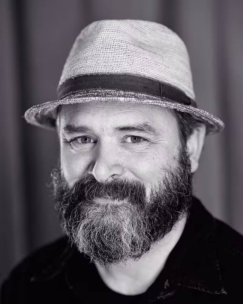
Vasilis is a lecturer at the Amsterdam University of Applied Sciences. Here he teaches the next generation of digital product designers about the web. He believes that universities should research important topics that “the industry” tends to ignore. That’s why he teaches mostly about desiging for accessibility (and about CSS, which can use more love as well).
Talk: Exclusive Design
A few years ago Vasilis was trying to become a better inclusive designer. During his research he realised that he knew quite a lot about the guidelines and the theory behind technical accessibility, but he didn’t know that much about the people who actually need these guidelines. So, he started to invite real people with disabilities over to their university. In a few different courses his students design and create tailor made products exclusively for and with these people. The idea is, that by closely observing how real people use their computers, they will better understand people and become better designers.
Some of the things Vasilis is going to show in this presentation: a tool that makes it harder to type for someone who has difficulty typing, a website without any semantics for someone who is blind, and some funny, yet invisible animations he created for a blind artist.
Transcription
[Music]
[Audience applause]
Vasilis van Gemert: Ah, thank you. Thank you that you’re amazed that I can drive a car.
[Audience laughs]
Vasilis: [Laughter] Okay. So, exclusive design, I’m going to talk about that.
I teach at university, and I have this course called Exclusive Design that students from all over the university can choose. And many of them didn’t read what it’s about, and I guess many of you didn’t read what my talk is about, right?
They think it’s about diamonds and getting rich, right? It’s exclusive design, beautiful, gold-plated stuff, and shiny things. Well, it’s not.
It’s also, unfortunately, not about the things that I make exclusively for myself, like this very old rotary phone. I put a Raspberry Pi in it, and now it’s an interface to play Spotify music, so it sounds like this if I pick up the phone.
Rotary Phone: Dial 0-1 to listen to Vasilis’s Discovery Weekly.
Vasilis: And then I have to dial 0-1 to listen to my Discovery Weekly.
This is not what I’m going to talk about. I’m going to talk a little bit about designing for voice, though, so this kind of fits into my talk.
Five years ago, I did a talk (called Exclusive Design) in Berlin at the Beyond Tellerrand conference. Maybe some of you might remember it. Anybody?
[Audience cheers]
Vasilis: Oh, whoa! Yeah. Good. This is not the same talk.
Back then, I talked about the very early stages of this exclusive design research that I’d been doing for the past couple of years. Back then, one of the things that I talked about was this event that I had organized with all of these fantastic designers, teachers, and artists.
We looked at how we can design for accessibility. Not so much at how can we engineer accessibility but more what if you put a design and a more artistic mindset to accessibility, what would happen?
The idea for this came from also five years ago. I invited Leonie Watson over to our university to give a talk, and I asked her.
We have been using interfaces, graphical user interfaces, for, well, as long as we can remember. Some of them are actually nice to use. They are maybe not pleasurable, but they are nice. They’re not hard to use.
I asked Leonie, can you tell us how we can design pleasurable user interfaces for somebody who has to use a screen reader?
She came over to Amsterdam to talk about this, and the answer was actually very, very depressing because, for me, it’s a pleasure if something works - just if it works in any way, even if I have to open up the developer tools and fix the HTML. Turn the div into a button. Even if I have to do that, it’s a good interface.
That was just so depressing. I thought I somehow have to do something about this.
I started researching inclusive design. I thought, well, a way to make the Web more inclusive is by practicing inclusive design, so I looked it up. I found a few principles. This is a set of inclusive design principles.
Originally, there were seven of them, but I think seven is just too many principles. I can never remember all of them, so I turned them into four principles. Easier to remember. If you follow these principles, you will see that the websites or the things that you create become usable for many, many more people.
Here they are:
Consider all contexts, so think about every possible way that somebody uses your website or your product.
Then be consistent is the second one, which is an important one. It talks about using patterns that people remember, that they know how to use. For instance, the navigation of a page is always at the top of the page, so don’t put it somewhere else where people have to look for it. Put it there where people know where they can find it.
Then it also says that you should prioritize content, which means that you think about the content and structure it well, of course.
Add value. Don’t waste our time. Just make sure that the people can actually do what they have to do on our page.
Great set of principles, and I think everybody should live by it.
A good way to test principles, design principles, is to flip them and see what happens with the opposite of the principles. If you look at that opposite principle, if that still works, then it’s a good principle.
I flipped them, and then it turned into this, and this is a very interesting set of principles because I thought I would like to consider all contexts, but do I know all the contexts? Do I actually know how somebody who needs a screen reader, do I know how they use the Web? Do I know how that looks, what it feels like, or what it sounds like? Do I know what the problems are that somebody who is deaf has with, for instance, a podcast?
I can think about it, but I don’t know it. So, I thought, before I can consider all contexts, I have to know all these contexts. I have to study them.
Then if in the process of studying these contexts I found out that some of the patterns that we have been using over the years are maybe not that good, then I should be allowed to ignore all these conventions. This makes sense.
This is also something what struck me when I looked at these principles is that these are the principles that I’ve been using over the last 30 years as a designer for myself. I’ve been studying my own situation. I’ve been designing for myself. I’ve been ignoring all conventions if I don’t like them.
There’s the other one, prioritize identity. My identity is in all of the websites that I’ve been making. And it’s worse than that. My identity is the Web as a whole because I am, let’s say, the developer and the Web designer. I’m a nerd. I’m a white male. So, this white male beardy nerd identity is in the Web that has defined what the Web looks like in such a big way.
I thought, when we study these people that we have been excluding, that we have been ignoring over the last decades, what happens then? Will the Web maybe change? Will it be different if we add their identity to the designs that we make?
Then last, add nonsense. Oh, yes, of course, because it’s fun to design. It’s fun to make stuff. Also, we have to allow ourselves to add nonsense, to allow ourselves to add nonsensical ideas to our design process, because otherwise, we’re only going to make what we already know that works. Especially in the field of something like accessibility, we have never designed for it, so we have to allow nonsense to it to investigate how we can actually design for it.
These are the principles that I’ve been working with.
Let’s start with ignoring conventions, and we’re going to start with the second point of this list, not the first one.
Ignoring conventions: Why should you ignore conventions? Well, there is a good reason. There are many good reasons. But for instance, sometimes the defaults are just not good enough.
For instance, years ago, I made this website. It’s a beautiful, responsive website, so it adapts to different circumstances, for instance like screen size. And I used HTML to mark this up, so when you have a very, very, very old browser that doesn’t support border-radius, for instance, it looks like this.
If you have a screen reader, it could sound something like, “Balls, two connected balls, a blue ball, a blue ball, a red ball, two connected balls, a white ball, a white ball.” That would be fantastic, right? This way, somebody who cannot see the illustration can actually think about the illustration and maybe come up with something more beautiful.
This is the wonderful thing about the Web. The problem here is that a screen reader doesn’t read it out like a poem. It says, “Heading level one. Balls. Heading level one. Two connected balls. Heading level one. A blue ball. Group three items. Heading level one. A blue ball. Et cetera. Et cetera. Et cetera.”
Every damn website sounds like this. It’s horrible. It’s an absolutely horrible experience.
I think we are allowed to research how we can do things better. I don’t think it’s acceptable that we think we have to make beautiful websites with circles that move around, for ourselves, and this is a good enough experience for somebody who cannot see it.
How do you do that? I just asked somebody who was blind, “Can I sit next to you for a while and just observe how you use websites?” I sat behind them, and we looked at this website, which is a Dutch website with all the Dutch documentaries that were ever made with, I think, public money. This is an enormous website, beautiful website with lots of documentaries on it, and a very important resource for when you do research, for when you’re a designer or an artist. This is an incredible source.
He couldn’t use it. And so, I said, “Okay. Just try and find a movie, and I’ll just sit there and watch what happens.”
So, the big problem for him, this person who was blind, was -- and he had turned blind maybe five years before we sat today, so he wasn’t a very experienced screen reader user yet.
He said, “Why, from the moment that I turned blind, did you silly Web designers start putting these weird words in your design? Why do you put heading level 2 and nav and button into your Web designs?”
He really thought that these words were visible for everybody. He thought it was a design trend. He didn’t understand these words.
As we saw in the last talk, HTML is actually pretty complicated. So, how can we expect that somebody who is not a nerd should understand what these words mean? What does a heading level mean? What does a nav mean, a navigation?
That’s nerd talk. Normal people don’t have to understand that.
Then the worst thing is, when he opened up this website, it said, “This webpage has 80 headings and 150 links. You need one of these links, and I’m not going to tell you where it is. It might be the first one. It might be the last one. It’s probably somewhere there in between. Good luck. And I’m not going to tell you what it’s called.”
This is the experience for him. For him, this website looked like this. Every element started shouting, “I’m the most important thing! Click on me!” It’s like one big, absolutely awful banner.
He couldn’t use it, so I took a look at the website, and I redesigned it for him, and then it looked like this. This is it. This is the same website. I scraped it, removed everything that wasn’t necessary, which was quite a lot, and it turned into, “I’ll keep it short on this page. You can find documentaries via themes, makers, and locations.” This is actually the navigation. These are three links that he was looking for in those 150 links.
There’s also something weird. There’s no semantics on this page. Now, this is of course -- you’re going to -- [laughter] I’m going to get in a lot of fights after this talk with a lot of people. He didn’t like semantics because he doesn’t understand what they mean, so this is just paragraphs and links. There is no heading levels, nothing whatsoever.
Then you can click through that. Then finally, you get to this page. And there’s a beautiful blue button on there. As you all know, that’s not a button. [Laughter] It’s a div, of course.
He did sometimes end up at a movie, but he was never able to play it because there was a div, and the div didn’t say, “Play,” it said, “Q,” the letter Q. That was because it’s an icon font that he used, and so this was sometimes he’d find a movie, but he could never play it.
So, I added a very big yellow button because you can see it. It doesn’t matter what color it is. It doesn’t matter where I put it. I just put it there. Then he can play it.
Okay, we have to agree this website that I recreated for him is very boring looking. There’s no identity at all in it. Unfortunately, with this person, my time ended, so I found another person to work with, another blind man, and I made this movie of how he uses a website.
This man is an artist. He used to be a famous Dutch photographer until he turned blind around 20 years ago. Then he started making audio recordings, so he started to record sounds from on the street, and he wanted to let me listen to one of his audio recordings.
He has to click on the right. On top there, there’s a large projector, a link there in the navigation. Then there’s the audio project that he wants me to listen to. Okay.
[Video played]
[Screen reader in a foreign language]
Vasilis: He found it. That’s the link. That’s the one.]
[Screen reader continues in a foreign language]
Vasilis: And now he just wants to play this audio player. Click on it.
[Screen reader continues in a foreign language]
[Video stopped playing]
Vasilis: [Loud exhale] He found it. How long did that take? That took about two minutes. How long would it take you? Two seconds, even if you don’t know the website.
I’ll get to 45 minutes, I guess, with this talk. I have many more of these examples. No, don’t worry. [Laughter]
[Audience laughs]
Vasilis: This is a horrible, horrible experience. In reality, it was even worse because I recorded this after the fact. This is not reality. In reality, I was sitting behind him.
At first, he clicked on the wrong link. And then he had to tap through the content and somehow find out that he’s on the wrong page. Then he navigated back. Then he finally arrived at this audio player, but he clicked the wrong button, and a modal dialog opened, which said, “Do you want to download ... 557777final-final-realfinal.mp3?”
[Audience laughs]
Vasilis: And he was like, “What is this?” He didn’t know what was happening. He didn’t understand what was going on. He didn’t.
The problem with modal dialogues is you have to know how to close them. And again, this man is not a nerd. He’s an artist. He has to use his computer every now and then, but he’s not somebody who really knows how these things work.
He wasn’t able to close it. How do you think he fixed it? He restarted his computer.
[Audience gasps]
Vasilis: So, I asked him, “How many times a day do you restart your computer?”
“Oh, all the time! You don’t?!”
He thought a normal user experience was restarting your computer 20 times a day.
Pfft. This is what we’ve created so far with 20 years of Web accessibility.
I think we can do better, so I removed the navigation. I made a new website for him that looks like this. There’s lots and lots and lots and lots going on under the hood in the HTML, the things we don’t show here.
The identity part here, this thin layer of, well, a little bit of design. There’s some color. There’s lots of white space. There’s lots of contrast so he can maybe see a little bit if he has some eyesight here left on the edges of his sight.
There’s color because he’s a colorful person. His photography used to be very colorful. There are just these little things in the HTML where every button sounds different. It doesn’t say, “Audio play button.” It just reads out what will happen when you click on the button.
I did some designing there. I tried to make it a little bit more humane. But it’s still boring. It’s very boring.
So, I asked my friend. “Is there maybe -- do you have some ideas that you didn’t dare to tell me, didn’t dare to share with me?”
He said, “Yes, actually, I would like, with every audio project, a little, fun, illustrative animation that illustrates what you’re going to hear.”
I said, “What?! Do you want me to design invisible animations, because you’re not going to be able to see them?”
How do you do that? Well, the normal way to design, let’s say, something for somebody who is blind, if I make an illustration or an animation, I would make it alternative text, so describe what I see.
I flipped this around. This is an example of an illustration that I made about the ferries of Amsterdam. It sounds like this.
[Audio played]
Male: Ha! Look at that! Two ferries are ferrying from one side of the screen to the other, bouncing, bong-bong-bong-bong against the sides of the browser.”
[Audio stopped playing]
[Audience laughs]
Vasilis: It is funny, right? He really laughed out loud because this was the first time that this pretty boring voice said something weird like bong-bong-bong-bong.
[Audience laughs]
Vasilis: He was happy with that. Now, this is actually a very good way to design an animation because animations are pretty hard to make. But writing the description of an animation is not that much work. If it doesn’t work, pfft, just change it until it works. It’s actually a clever way to design illustrations.
This is what it looks like. There are two ferries that bounce, bong-bong-bong-bong against the side of the browser. Much harder to make these illustrations than to make the description.
Here’s another one about a hammer. So, there’s this audio recording in a big, old industrial complex, and you heard this sound of somebody hammering on metal. Okay, I can use a hammer.
[Audio played]
Male: Ha-ha-ha-ha. There’s a hammer that slowly ticks the text down a bit.”
[Audio stopped playing]
Vasilis: Did you hear that? You can actually make screen readers giggle.
[Audience laughs]
Vasilis: He didn’t know that, and so I actually started a whole research about international giggling for screen readers. It’s pretty hard, actually, because every voice does it differently. Some Dutch voices, you can make them snicker like [snickering].
[Audience laughs]
Vasilis: Which is just fantastic. But if I use the same letter combination in English, it sounds like gah-gah-gah-gah-gah, which is also funny, but it’s something else. It’s really complicated to design this well, but it’s real fun to do it, and it’s pretty easy because nobody has done it before.
This is the illustration of the hammer that slowly ticks the text down. It’s so much fun to make this website.
Okay. This is what it looks like when you scroll through it. When you scroll through it with a screen reader, every time you come to the next section, it reads out the illustration. It reads out the animation.
Again, this website also has very little semantics in it, so there’s no heading levels. Again, I’m probably going to get into a fight with lots of you and, pfft, you’re right about it. But the problem here is that I think heading levels are very complicated to understand.
This guy. He knows that there is this shortcut to read out all the heading levels, but he forgot what the shortcut is. These are power tools, and you cannot expect somebody who is just a casual browser, somebody who has to use the Web every now and then, to remember all of these different settings. He’s not a Photoshop user or something like that. He’s just-- [Laughter]
It was so much fun to make this website. [Laughter]
[Audience laughs]
Vasilis: So, I think we should think about these things and think about how do we--
It’s not that easy just adding the right semantics. It’s not just going to fix these things. We really have to study and work together with the people that we design for. We should design with them.
[Audio played]
Male: Bong-bong-bong-bong. Ha-ha-ha-ha-ha.”
[Audio stopped playing]
Vasilis: So--
[Audience laughs]
Vasilis: Let’s go to my students. Um... I’ve been teaching this for quite a few years now.
Do I still have 18 minutes? Really? Pfft. Whoa! Okay.
I’ve been teaching this for quite a few years now. At first, I had this just small course of three weeks. One of the things -- one of the people that we work with, so I invite all these friends over. My students really test with them and test for them, so they create these little websites, little interfaces specifically tailormade for this one person with this one problem.
Here’s an example of something that a student of mine came up with for somebody who has difficulty typing. This is a friend of mine. He has a severe motor disability. He has, well, if he has to type something, it takes a lot of time.
Now, this guy, this student of mine, he came up with the idea of typing. Instead of if you want to type one letter, you should type two letters, which sounds ridiculously complicated. It sounds like the exact opposite of what’s needed for this friend of mine.
If you have difficulty typing, don’t let them type twice as much. Right? That’s the first thing.
But because I asked him to think about nonsensical ideas and allow nonsensical ideas, he just built it, and we tested it. It looks like this.
If you want to type exclusive design, you have to use combinations of u, I, o, j, k, and l to type letters. If you type two letters, it turns it to one letter.
Now, this is very complicated. But it turns out, if I use this for a while, I get used to it. I can type with one hand now, and I can type pretty easy.
Now, the thing that it solves for this friend of mine, I told you he’s severely motor disabled, so he has only one hand that he can use, and it moves like this. He has no control over it at all.
He wants to type the E, and his hand goes like this up to the E, and he clicks it. And then he has to go to the X. He goes down, and he clicks it. And then there’s a C that’s next to it. His hand has stabilized because it’s on this place. He can just tap the C. Then he has to move all the way over to the L, and that’s a lot of work.
Moving from end of the keyboard to the other was a lot of work for him. Now, these are the movements that he has to make when he wants to type exclusive design, and these are the movements that he has to make when he wants to type it in this system that the student-designed for him. He doesn’t have to move his hand at all. It’s just there, six keys that he can just type. For him, this is a much faster way of typing.
I really like this idea. My student told me; I was never going to test this if you didn’t allow me to add nonsense to the project, if you didn’t force me to come up with nonsensical ideas, because this was just such a ridiculous idea. I was never going to do it. It turned out actually to be a pretty good idea.
Here’s another one, a beautiful example. I’m very proud of this. Well, my students should be very proud of this one.
This is Eric. We work with him a lot as well. As you can see, his hands have grown in a different way, and the thing he always wanted to be able to do was to play the guitar. Not just play it. He wanted to be able to improvise on the guitar.
He told my students, “Fix it.” [Laughter]
[Audience laughs]
Vasilis: Well, at first, they tried all kinds of things. They had ten weeks for this project. Here, you will see Eric playing this new instrument that they designed for him. This is tailormade for him. It’s tailormade for his musical taste. It’s tailormade for his hands, so there’s this whole design process that went up before we made this.
This is the first time he actually sees the thing and the first time he tries to play with it. He had never played guitar, of course.
[Video played]
[Indiscernible voices and guitar music heard]
[Video stopped]
Vasilis: Sorry about the sound quality. That’s horrible. But it was wah-wah-wah-wah-wah. He started improvising right away. I think this is a beautiful, beautiful product, and it’s also all based on this way of really just getting the person into the design process.
Don’t design for them but design with them. Get them involved.
I think this is really some of the problem or one of the problems that we have with accessibility is that we’re all very good at reading the specs but we’ve never actually met somebody who has to use the specs or relies on these specs. We don’t test these specs with real people.
Also, this is not just a problem with the developers. It’s also a design problem. We never test our designs with real people. We write all these personas and, these personas, they always look a little bit like us. These used to when I was a designer.
I think these are really some of the things that we have to think about when we start designing for accessibility that we should involve the people and get them into the process and come up with new things.
Now, there are also some projects that I cannot show you because they’re invisible, so we work a lot with blind people. Let me try to explain what this one does.
One of the things that my students start doing immediately is work with a screen reader. Just like the people that I worked with, especially the first person, they hate screen readers. And they should because they’re horrible things to use. Well, they’re fantastic that they’re there, but the user experience is just absolutely horrible.
Some of them, they redesign screen readers in three weeks. [Laughter] “We’ll make a screen reader which is better than the original.” I love the hubris of some of my students. [Laughter]
Then there was this one guy. He made a beautiful interface. He’s a specialist in environmental issues, and he has to read all these long, well, very boring articles with all these tables in it and all these graphics in it. One of the problems that this man had, he was turning blind, was that he couldn’t read these tables anymore, so he couldn’t explain to his clients what was going on in these long articles.
One of my students, he talked to him, and he found out that this man was a sculptor, so a blind sculptor. He makes beautiful sculptures with clay.
He said, “Okay, he thinks not flat. He thinks three-dimensionally,” so he made this just ridiculously complex way to navigate through a table with your phone. By moving your phone, you would go from one cell to the other. It was just overly complicated but very nice.
These are nice techniques, nice ideas to work with. There’s lots of other stuff.
One of the bigger problems that blind people face, of course, is that when we look at a website, we immediately see, is this a website about My Little Pony or is this a website about Death Metal. It’s obvious, I mean if it’s designed a little bit. This is not a hard thing for us to see if we can see it.
The tone of voice of a website is pretty easy for us to find. But if every voice sounds like [speaking in monotone] “this, and every website sounds like this, it’s pretty hard to understand if it’s a serious website or a very, very, very, very funny website.” Right?
That’s really hard. The content has to be written very well.
One of the things that some of my students try to fix every now and then is just try to get an idea of what is the look and feel of the website and translate that to words. This is something that I think should be tried to add -- they should try to add this to assistive technology because I think this is really one of the bigger problems that we should fix.
Okay. Finally, there’s this example. This is one of my -- well, the very best students.
The assignment here is -- I don’t know if you’ve ever tried to watch a movie without sound. You probably have in the train or something. Every now and then, there’s just no sound with a movie.
People who are deaf, they experience movies in a completely different way. A lot of the suspense of a movie is in the sound.
Some movies that we are just, “What?! This is fantastic! This is just so exciting!” someone who is deaf is just sitting there, “Well, nothing is going on. This is the most boring movie ever.”
There’s also the thing with -- they do some closed captions, and they say something like, “Somebody is knocking on the door,” in a neutral typeface. But do we know? Is this a friendly neighbor who is asking for a cup of sugar, or is this a Nazi alien from hell? “Rawr! Open the door!”? We don’t know, but it says, “Knocking on the door.”
So, I asked my students to visualize the sounds to try to come up with what would it look like if we created a new experience for deaf people.
Now, this is the very best of these things. This is incredible. It’s made with HTML and CSS, by the way. I don’t think this is actually semantically very correct, this HTML, but it doesn’t matter. This is what he did.
[Video played without audio]
Vasilis: I think this is brilliant just how he used the original grids from the original comics, comic books. And when there’s a dialog, he put it into these grids. And where there’s action, he put it back into action, into the movie. I think this is just fantastic work.
I think if we start looking at accessibility, about designing for accessibility in a more artistic way or in a more designer-ly way instead of only as an engineering way, then I think the Web can be really, really better.
Okay, so--
[Audience applauds]
Vasilis: Thank you very much.